Week 1
Select a week to view the project notes and visual process.
FIRST
CONTACT
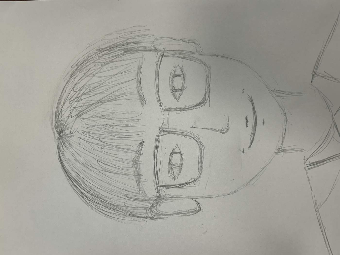
On Monday, I was paired with a female classmate for a portrait ice-breaking task. We drew each other and exchanged the portraits. While working, we shared our MBTI types, zodiac signs and hobbies. Our differences helped me understand her creative style and establish a friendly foundation for future collaboration.
ONE COLOUR.
THREE SYSTEMS.
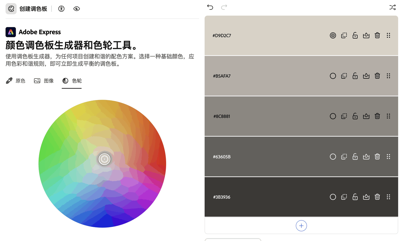
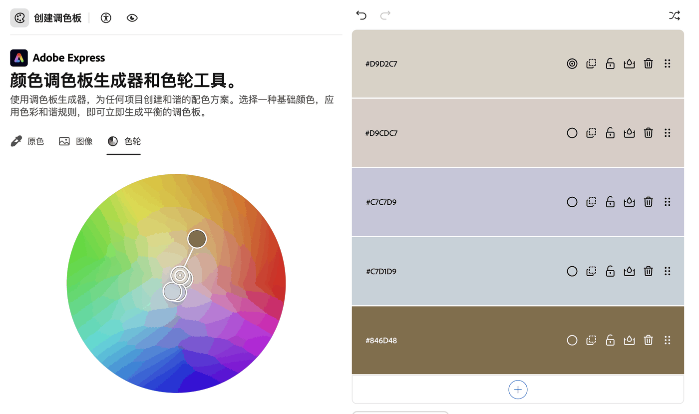
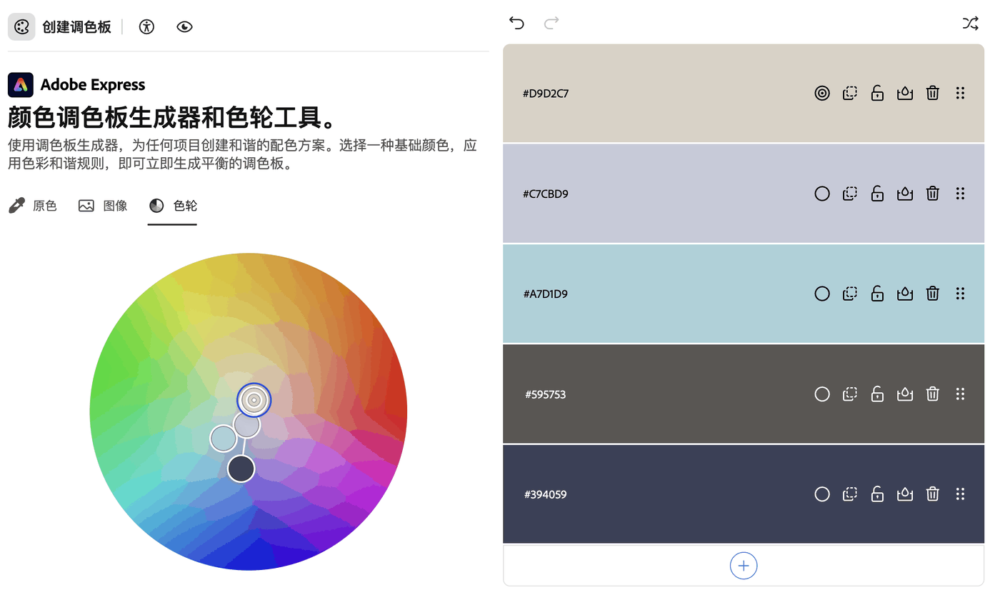
I selected one primary colour and used the colour wheel to derive monochromatic, analogous and triadic schemes. Placing the three studies together made the change in mood, value and contrast easier to compare.
SCREEN
TO PAINT.
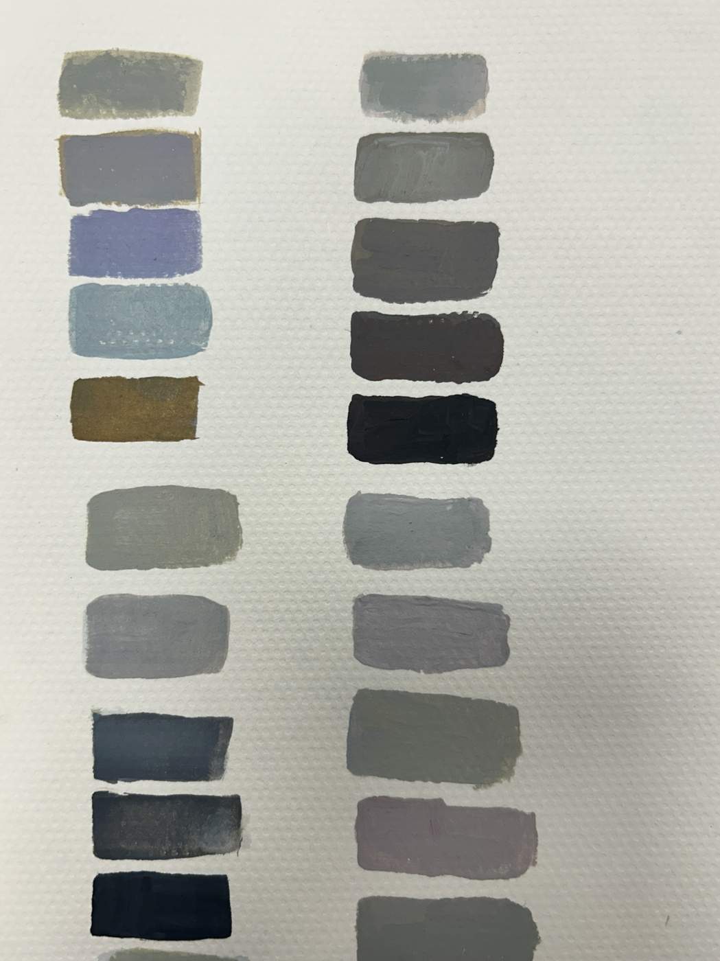
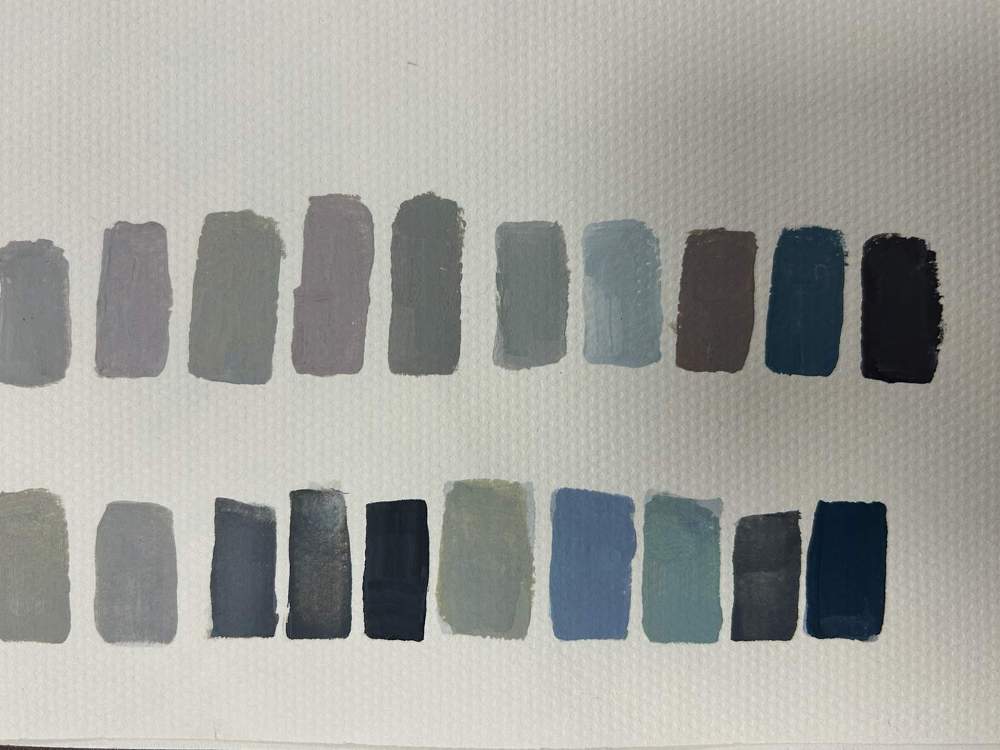
I translated the digital palettes into hand-mixed colour. Working with paint revealed changes in opacity, temperature and value that were less obvious on screen.
PRESSURE.
TEXTURE.
REPEAT.
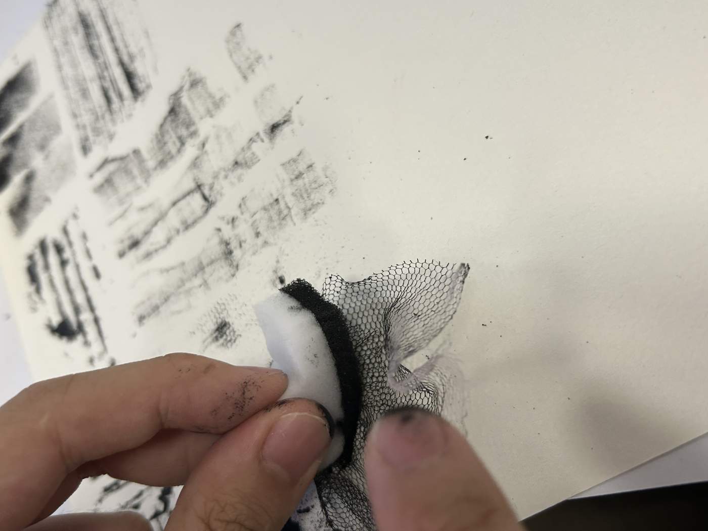
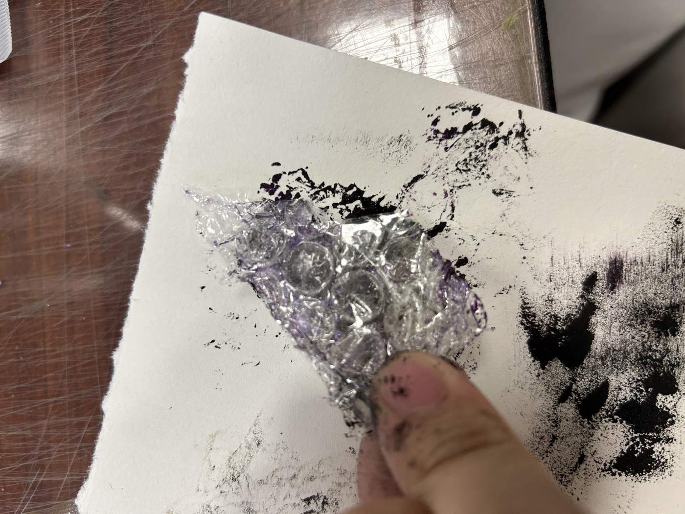
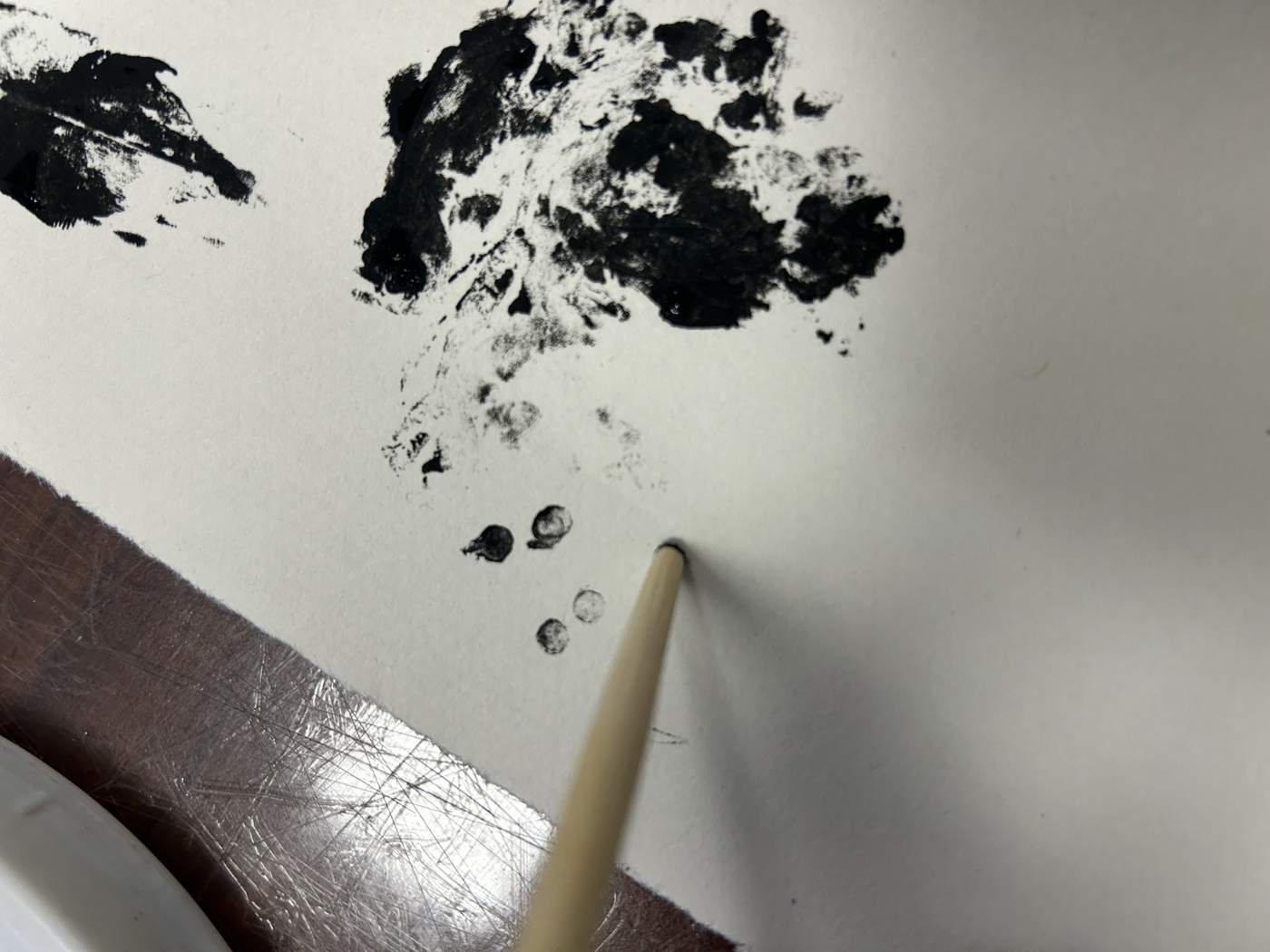
Cotton, mesh, foil and simple tools produced different densities, edges and accidental marks. Colour became a tactile experiment rather than a flat sample.
COLOUR IN
REAL LIFE.
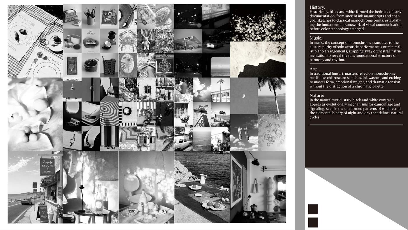
I matched real-life photographs with the three colour relationships to observe how each system creates a distinct visual feeling. The final board combines research, image collection and written reflection.
PAPER · FORM · CRAFT
PAPER
IN MOTION
This week I moved from observing paper as a flat material to shaping it by hand. Weight, texture, folding, tearing and cutting became a practical vocabulary for building form.
TOUCH.
WEIGHT.
SURFACE.
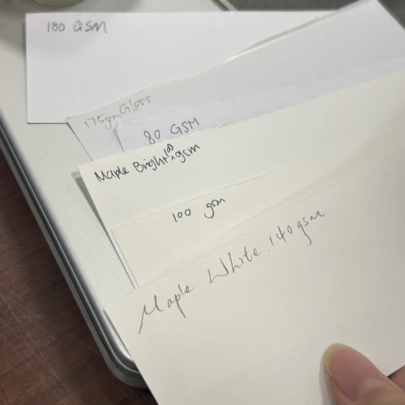
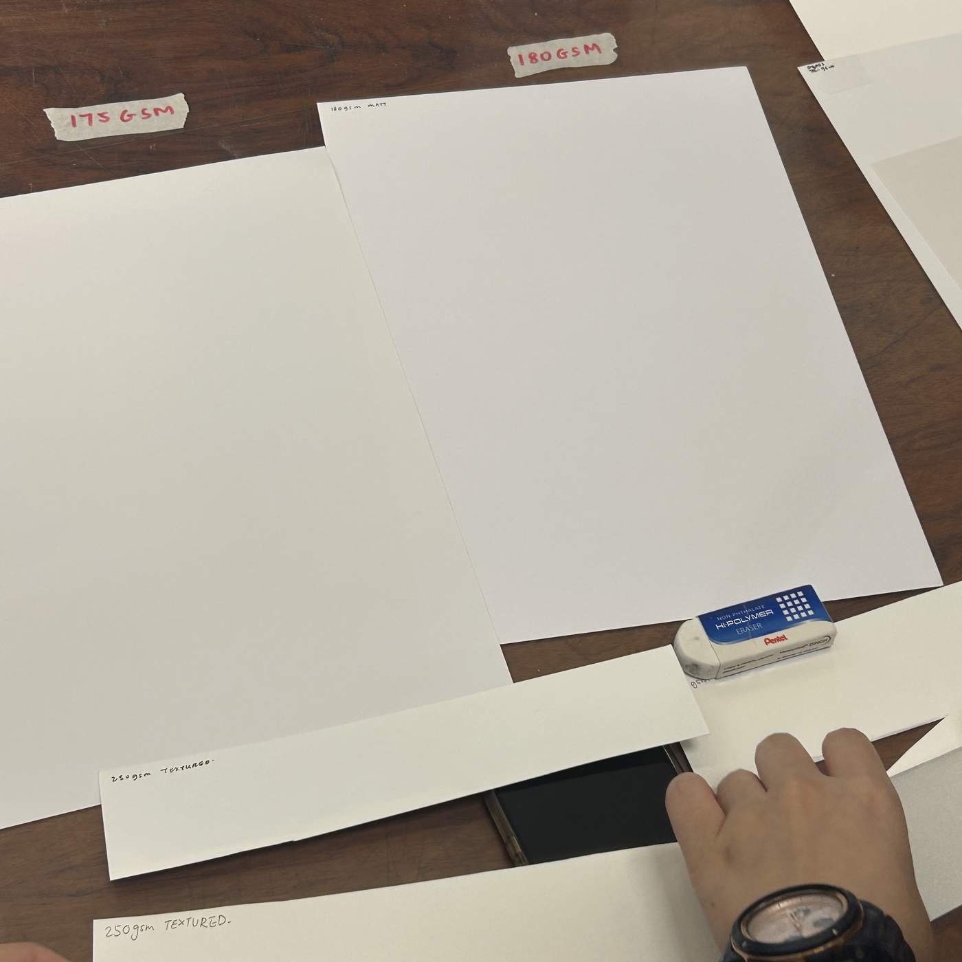
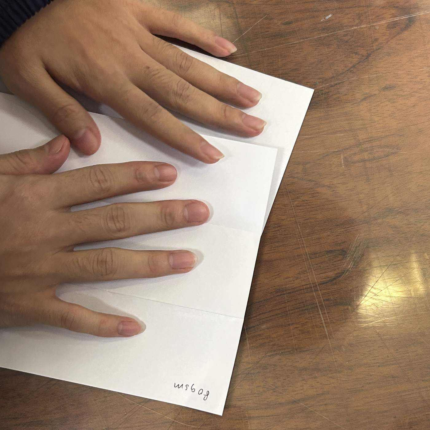
We explored ten kinds of paper with different materials, thicknesses, weights and print finishes. Handling them directly showed how grammage and texture change both touch and visual effect, helping me choose suitable paper for future artworks.
THREE
WAYS TO
SHAPE.
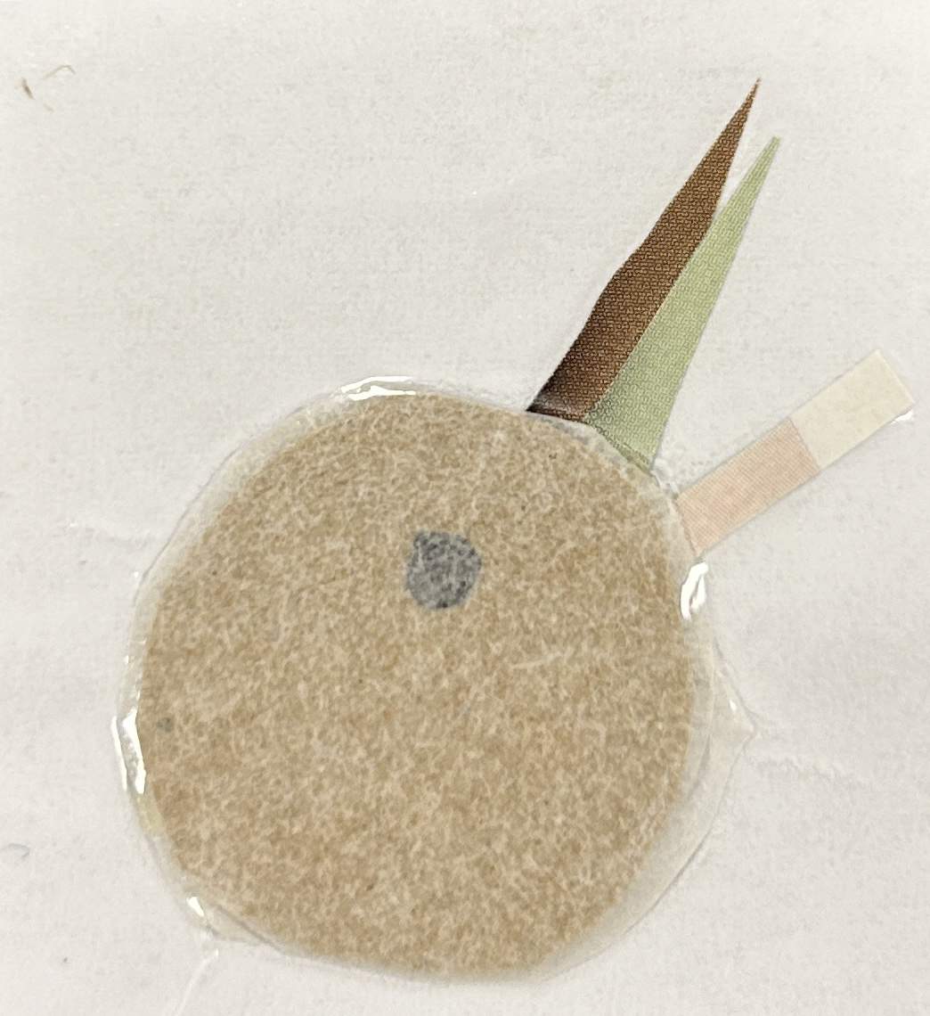
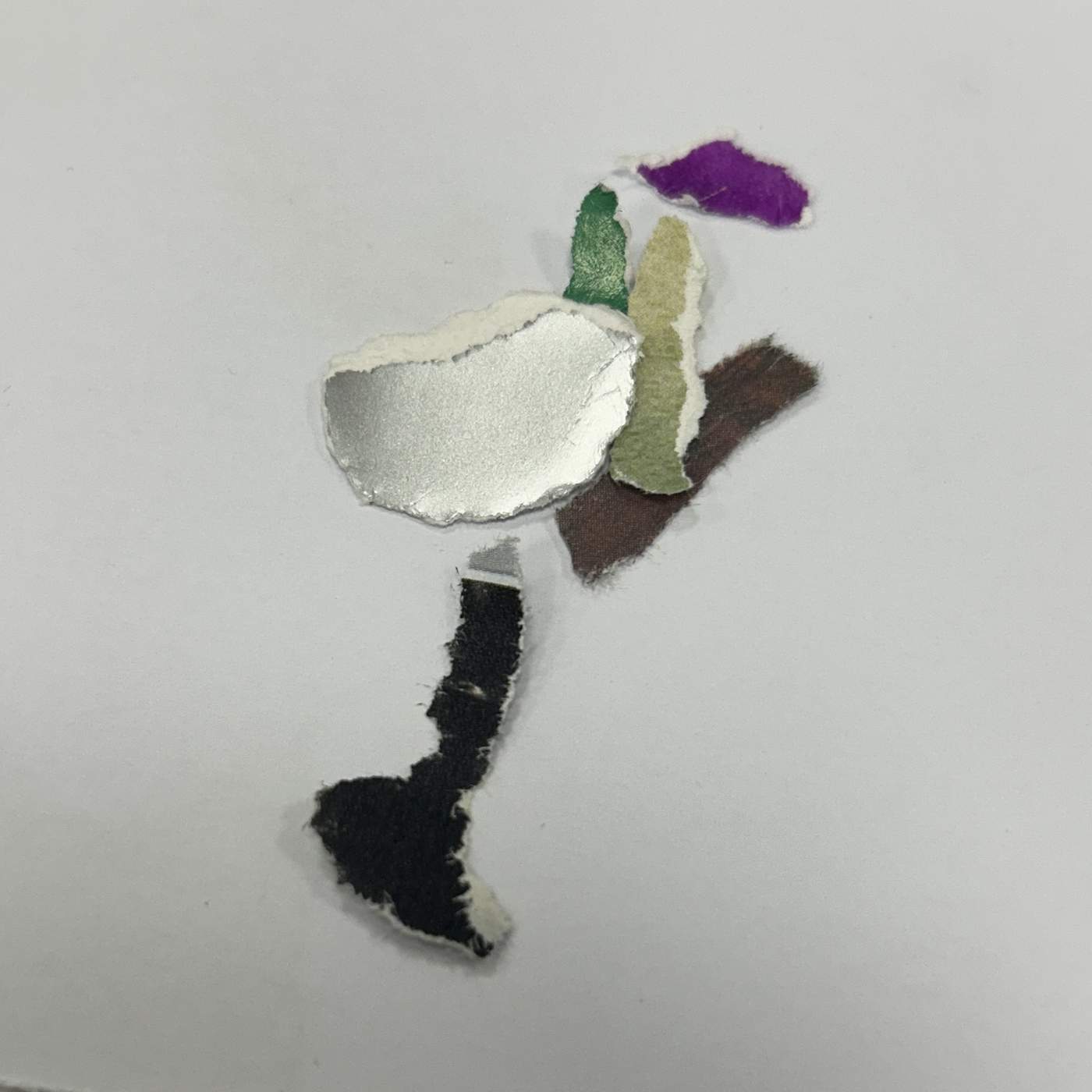
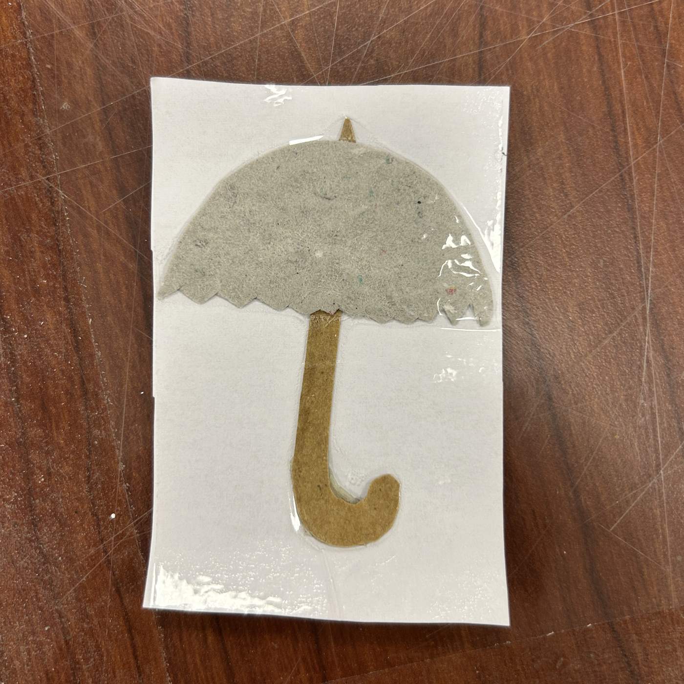
I tested controlled and accidental edges. Folding produced a coconut form; hand tearing formed a lively wine-glass composition; precise geometric cutting became an umbrella. A self-representational collage used an eye and a red vision symbol to express close observation.
LAYER.
SHADOW.
VOLUME.
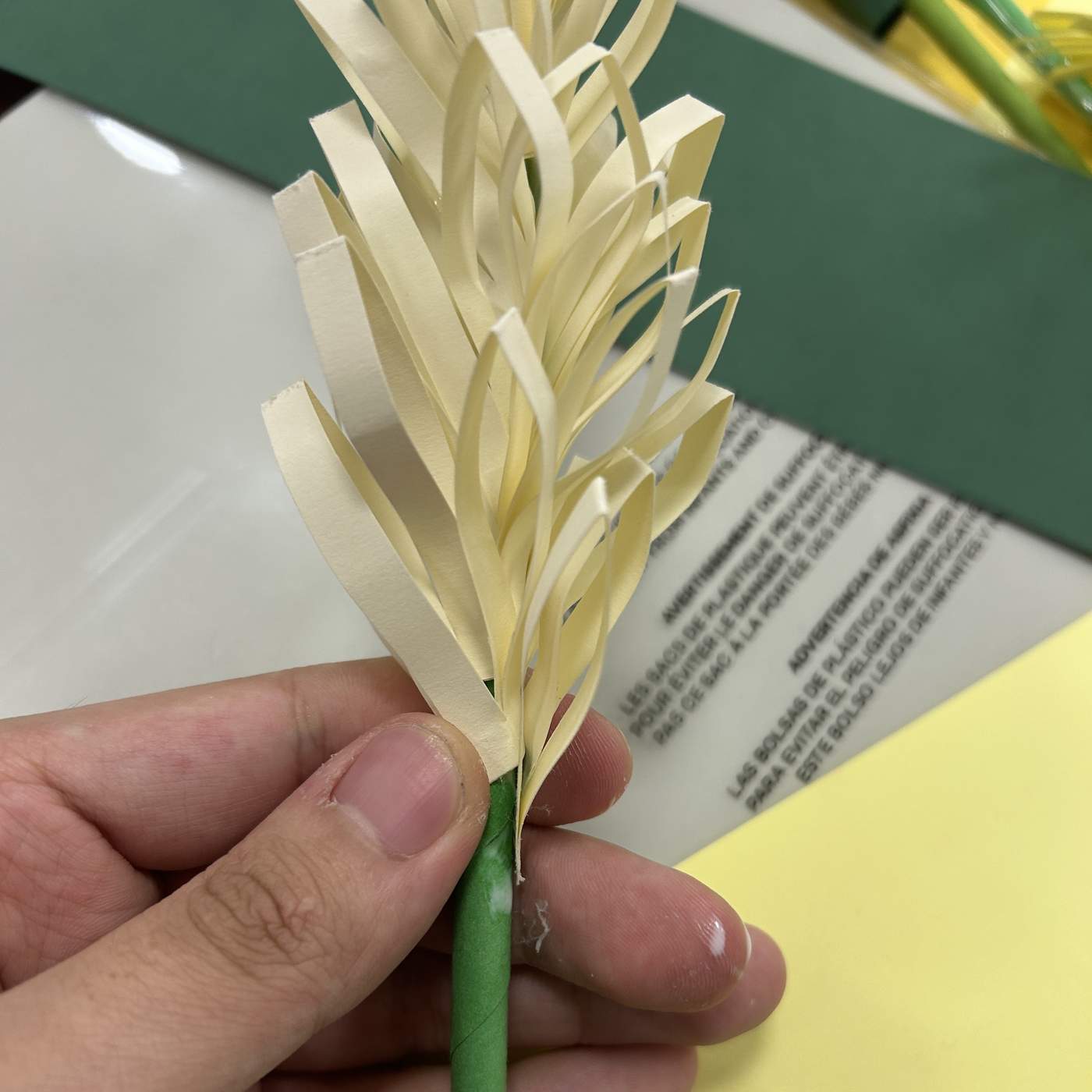
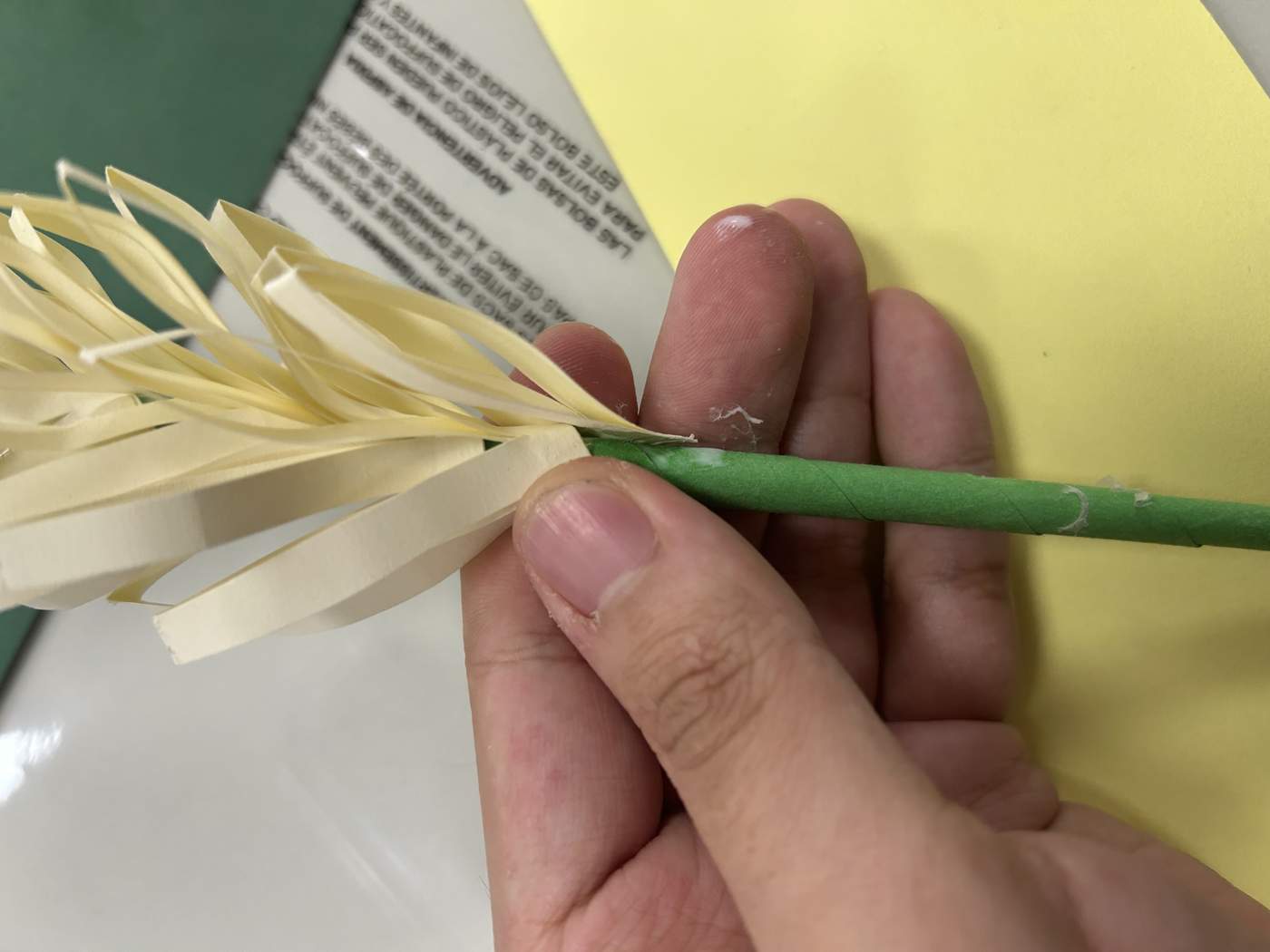
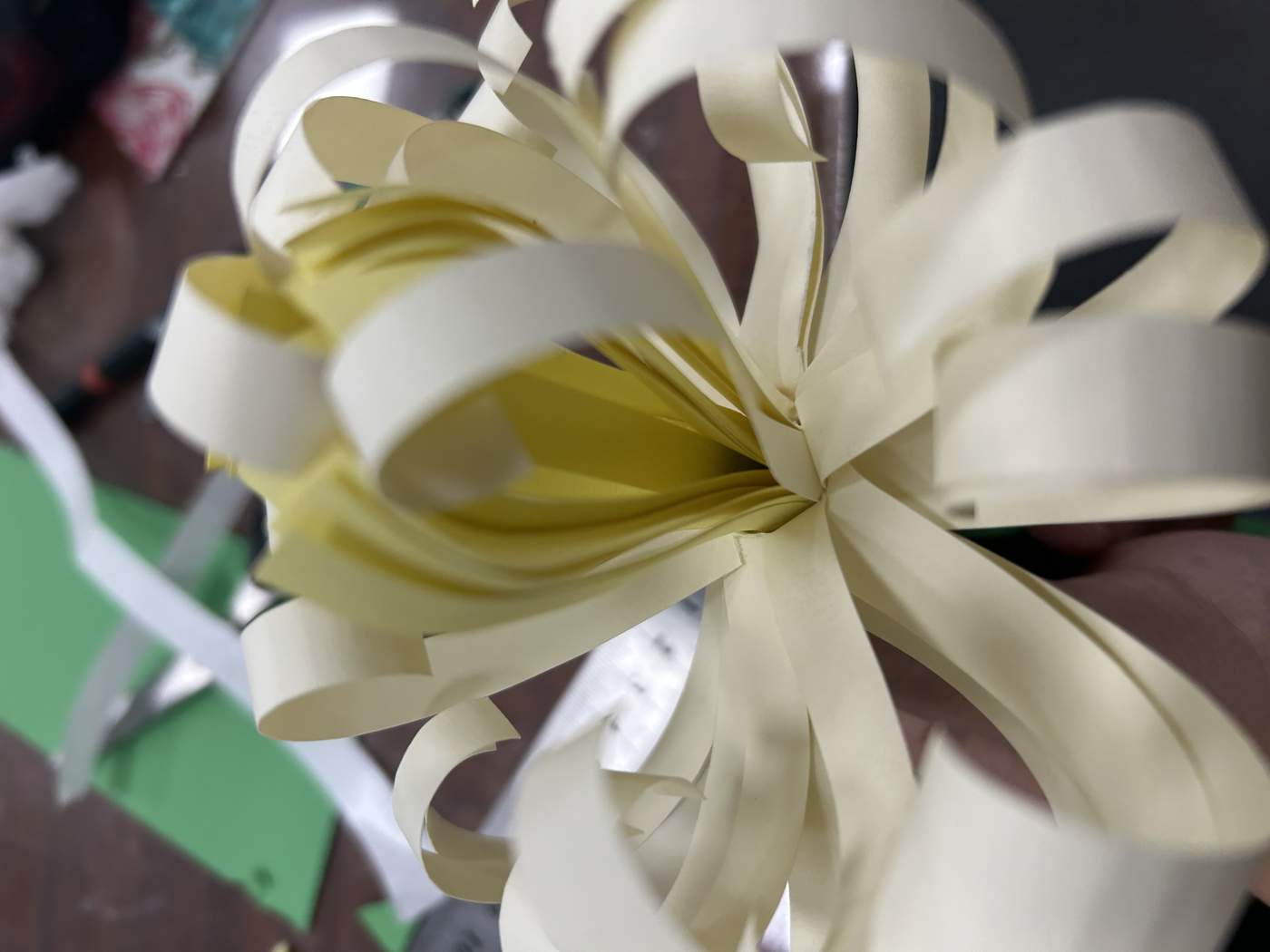
Folding and inter-layering transformed flat sheets into dimensional forms. The repeated strips create rhythm, while overlapping edges and shadows make the construction feel active from different angles.
A BOUQUET
BUILT BY
HAND.
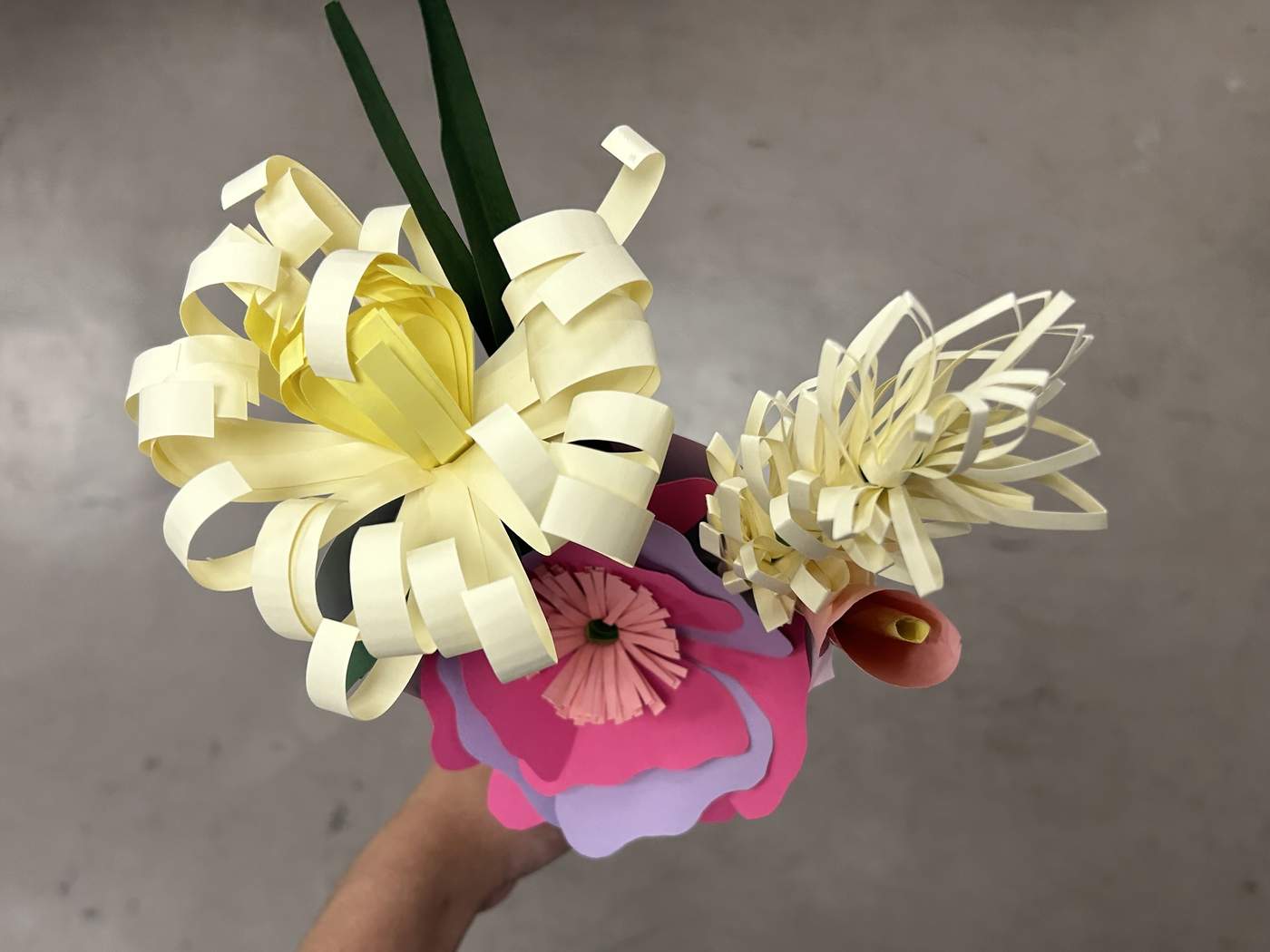
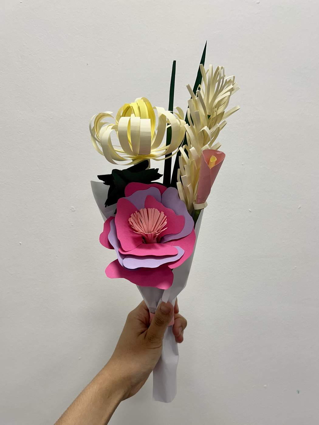
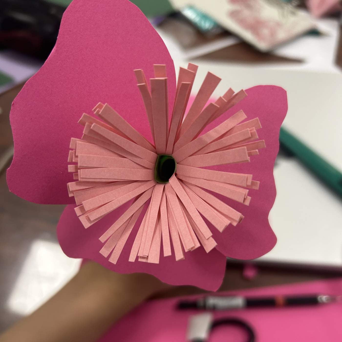
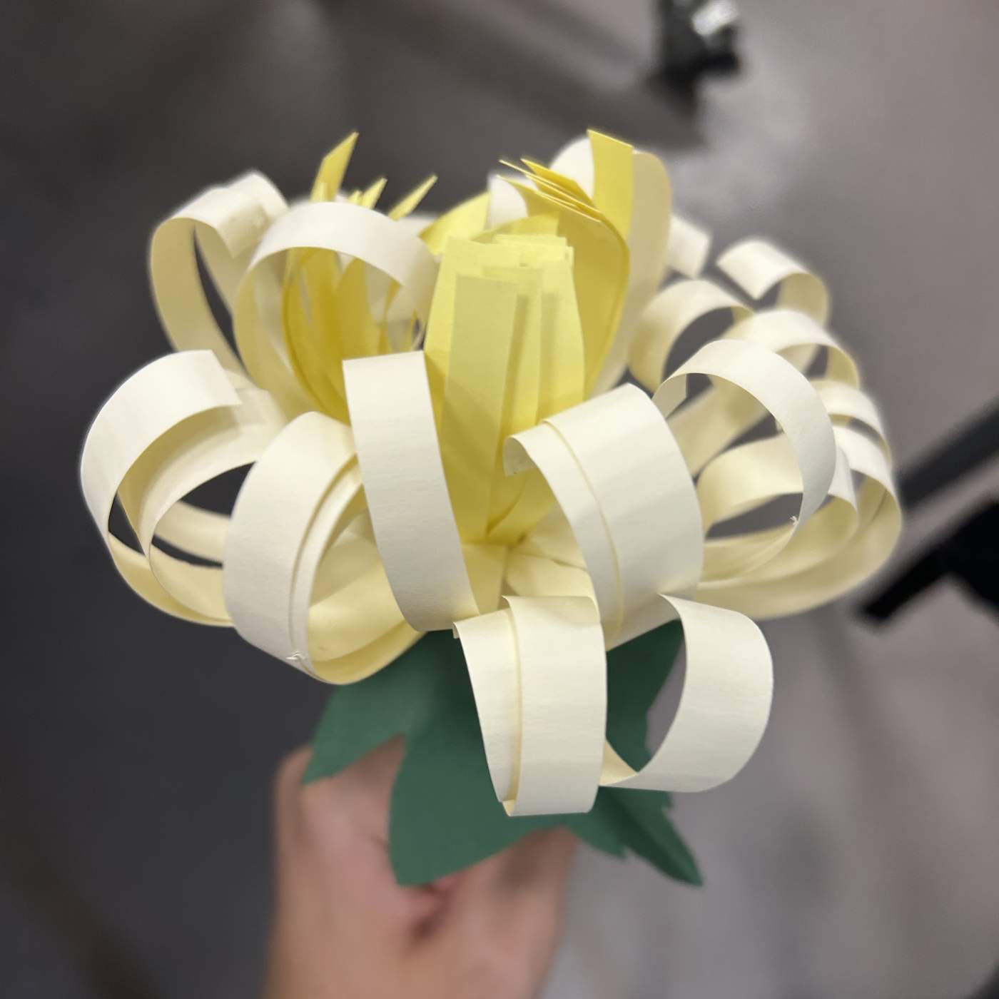
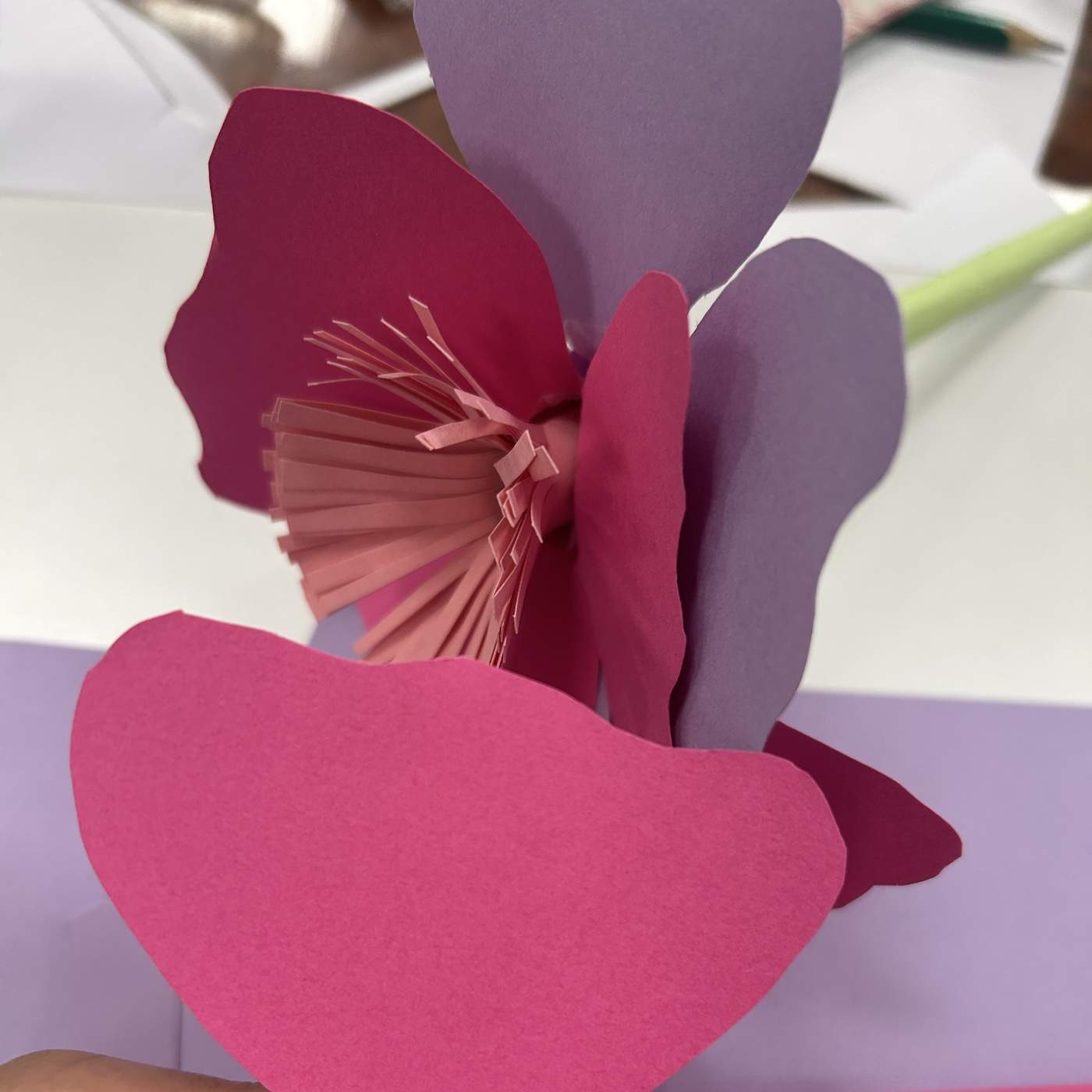
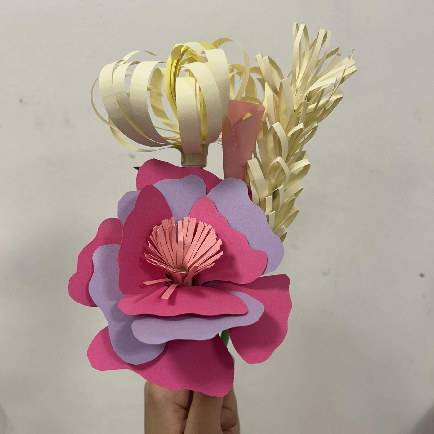
I crafted a pink tulip, a chrysanthemum and a blue rose, then added green paper leaves and assembled the flowers into a bouquet. The project revealed the delicate beauty of repeated cutting, curling and joining.
THE MATERIAL
BECAME A METHOD.
This week I moved from observing paper properties to making practical paper crafts. I gained a clearer understanding of how paper behaves, improved my hand skills and established a foundation for more complex handmade projects.
PATTERN · IDENTITY · COLLABORATION
OVER
UNDER
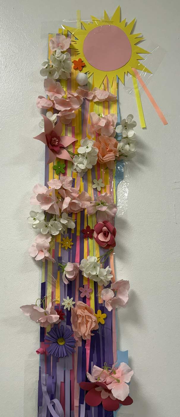
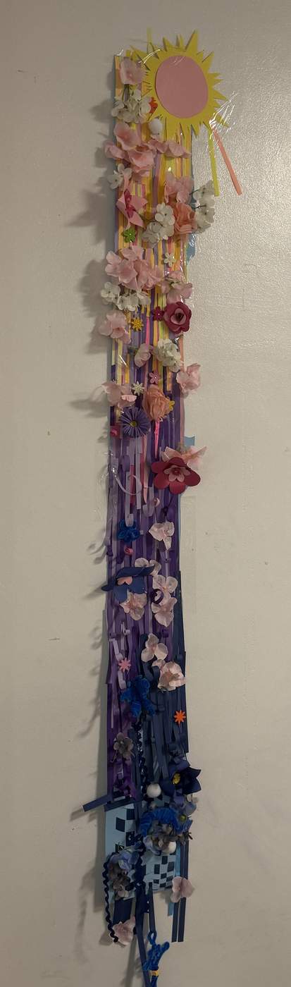
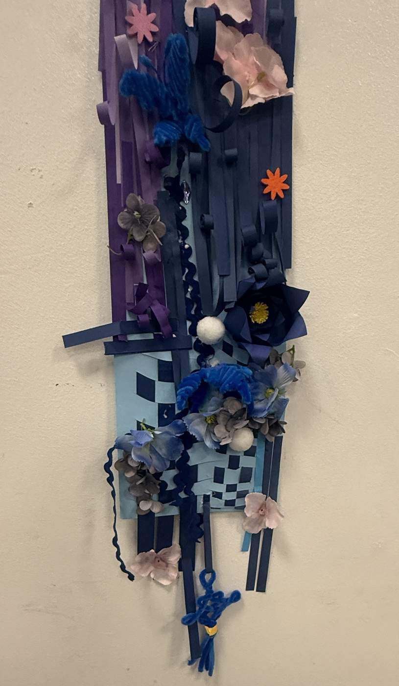
Paper strips became a system for pattern, illusion and collective storytelling. Individual experiments developed into a large sunset assembled by the group.
PLAIN.
TWILL.
ILLUSION.
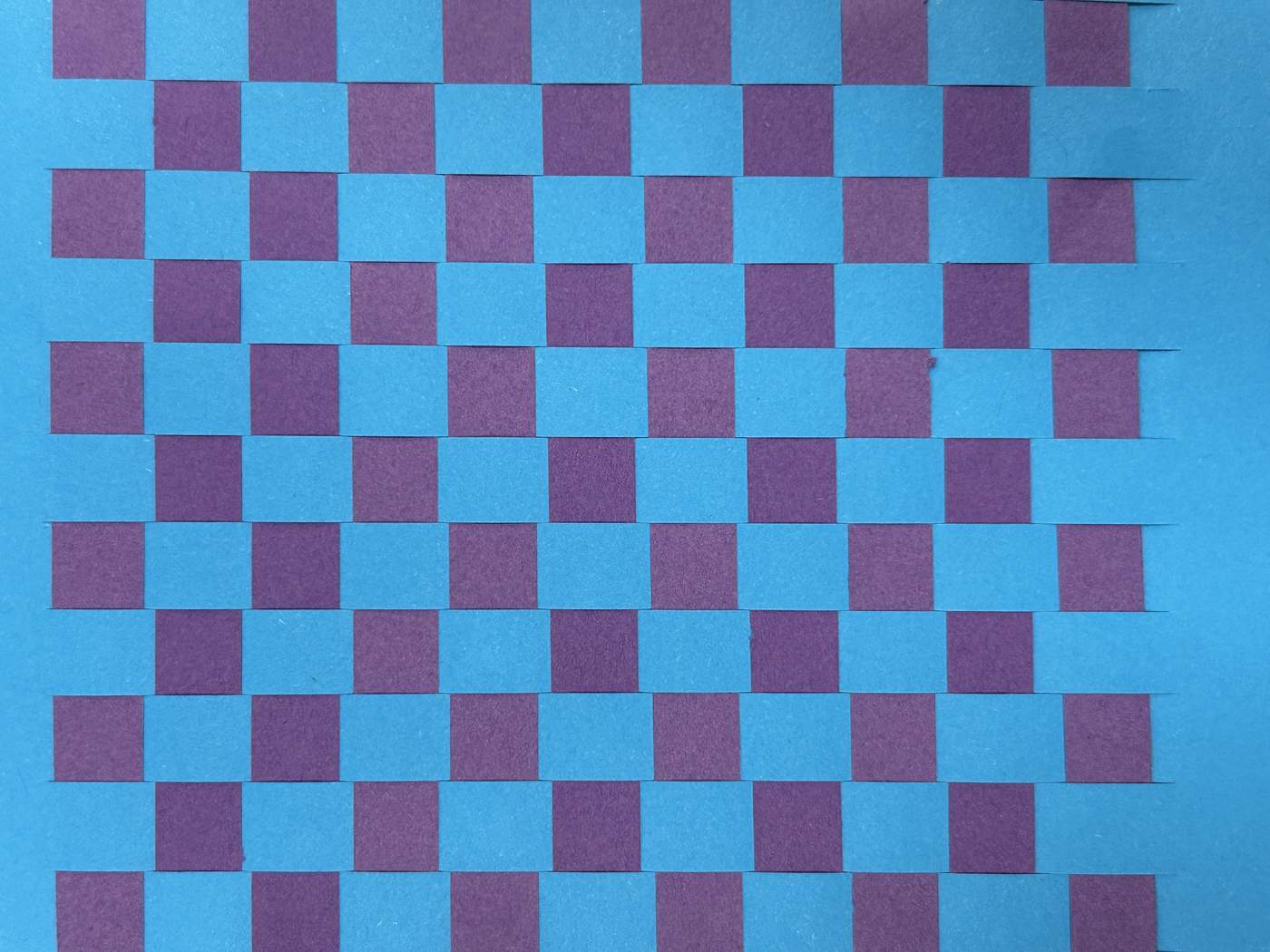
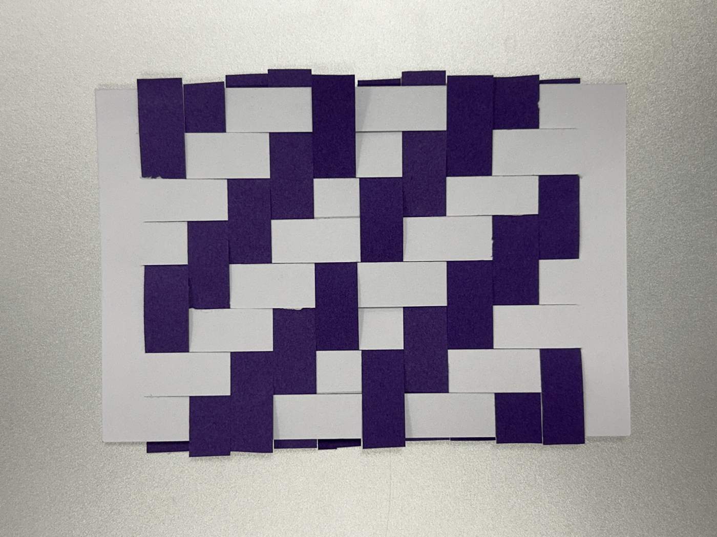
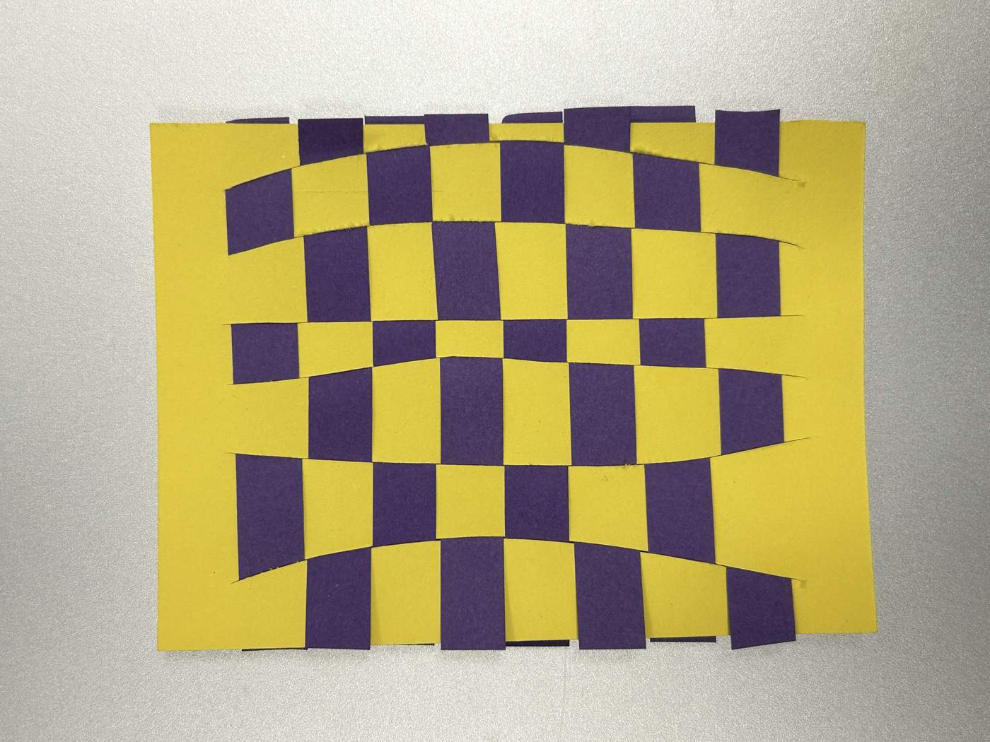
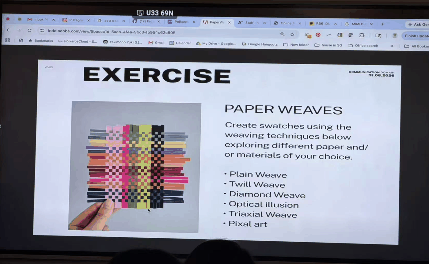
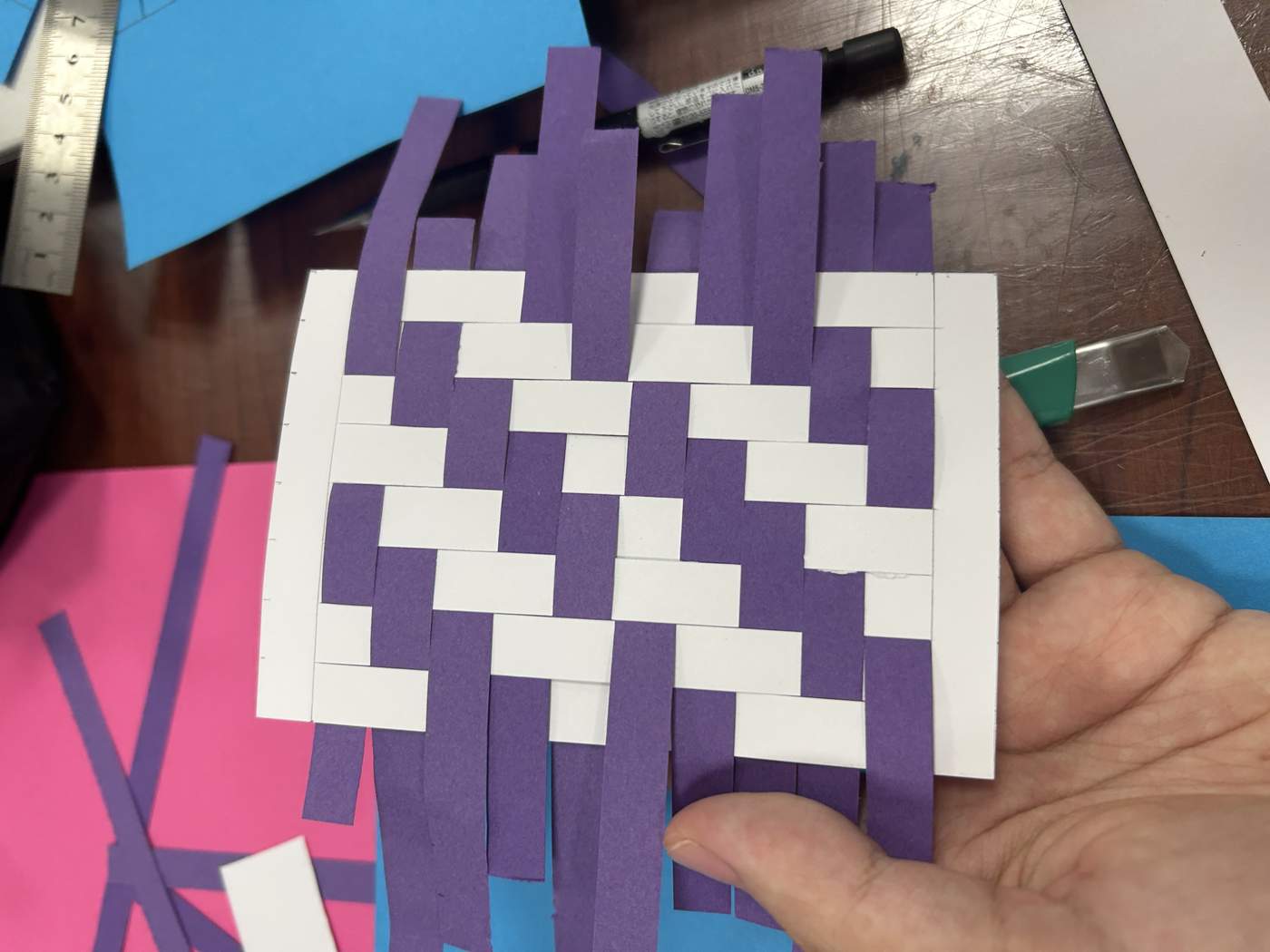
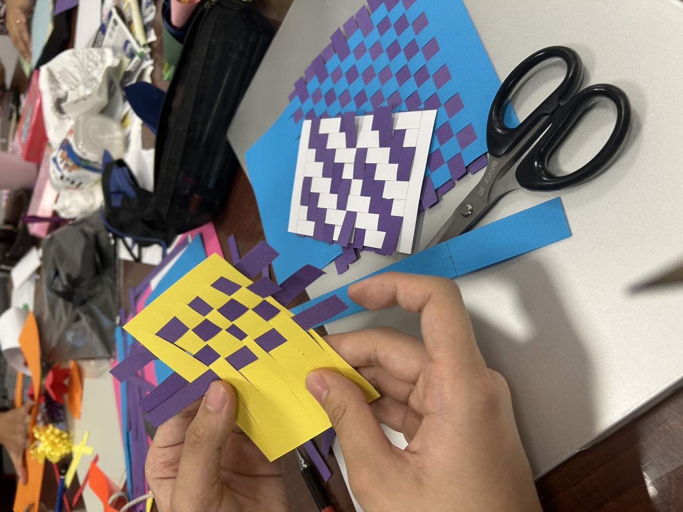
We studied plain weave, twill weave and optical illusion, testing how sequence, colour and strip width alter rhythm. Repeating the over-under action transformed simple paper into structured surfaces.
CUT.
ORDER.
REPEAT.
I used colourful strips to test different combinations and arrangements. The working process revealed how small shifts in spacing create movement, depth and unexpected optical effects.
EIGHT
WORDS.
ONE SELF.
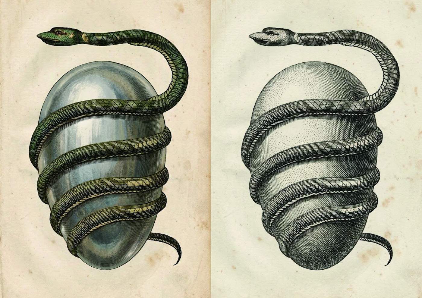
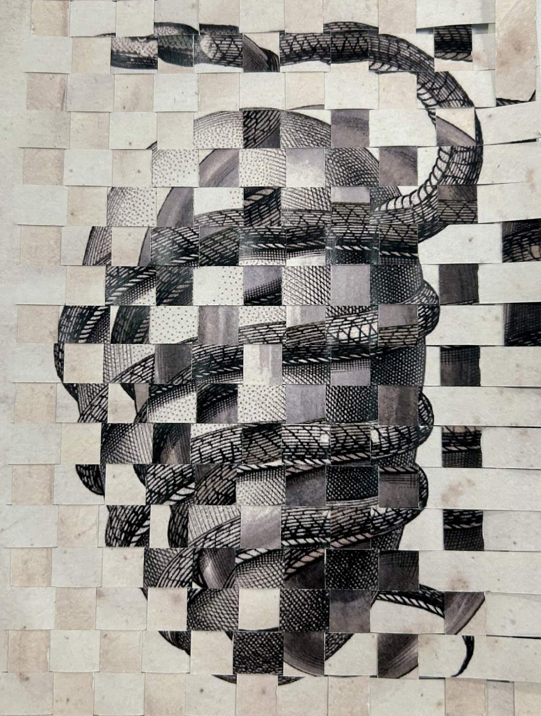
Black & White · Egg · Mysterious · Snake · Cold · Dark · Soft · Cute
I chose an egg as the central symbol and combined it with snakes to express darkness, mystery and the elegance of black-and-white imagery. Translating the eight abstract keywords into one image strengthened my visual storytelling.
ONE
SUNSET.
MANY HANDS.
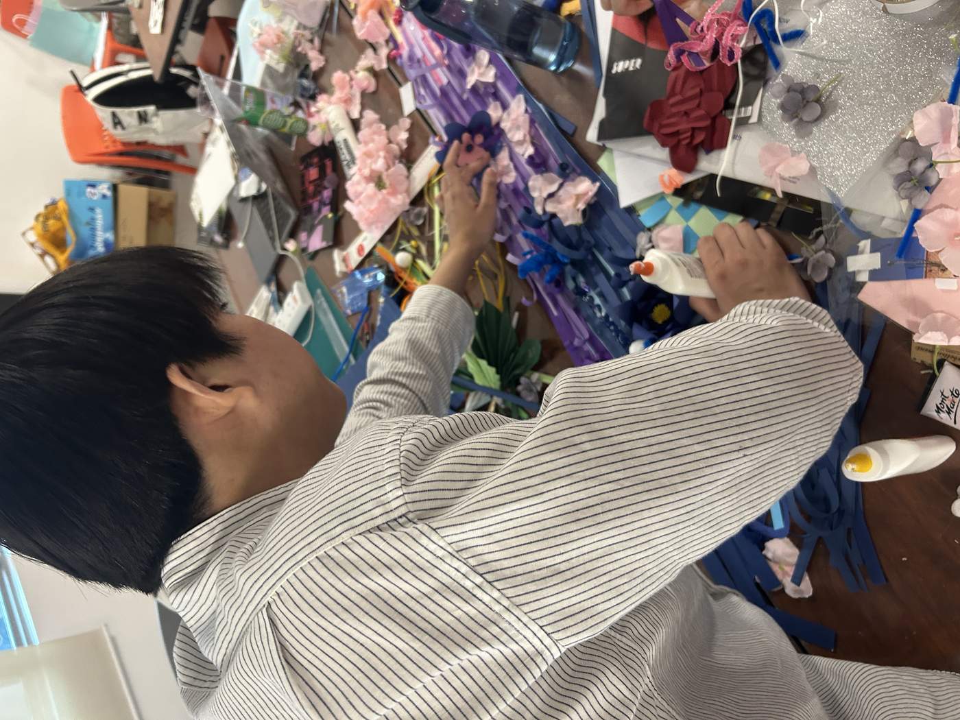
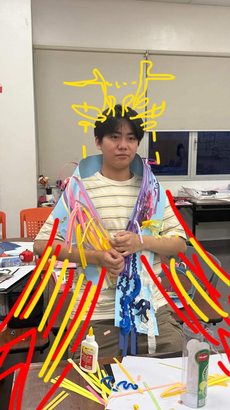
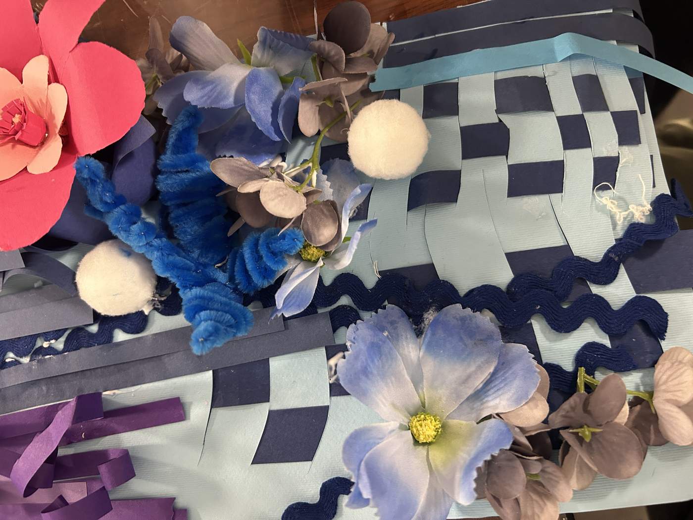
Our group created a large paper weaving that moves from a warm sunset into a cool evening sky. Pink flowers represent hope, blue and purple strips form the sky, and the yellow sun brings warmth. Each member made a section before we joined everything into one continuous work.
SEPARATE
STRIPS,
ONE WHOLE.
This week deepened my understanding of pattern, texture and visual storytelling. I learned how material experiments and individual ideas can be woven into a harmonious collective artwork.
DRAW · CARVE · PRINT
FROM LINE
TO BLOCK
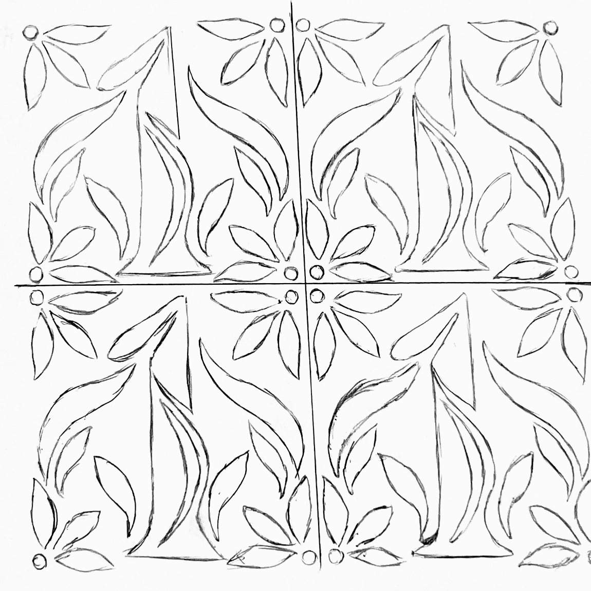
This week I explored relief printing through two personal designs. Drawing established the image, carving translated line into surface, and rolling colour across the block revealed how pressure and negative space shape the final result.
Y.
一.
GROW.
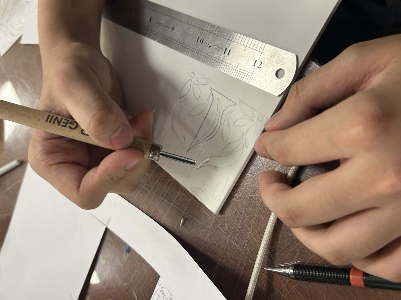
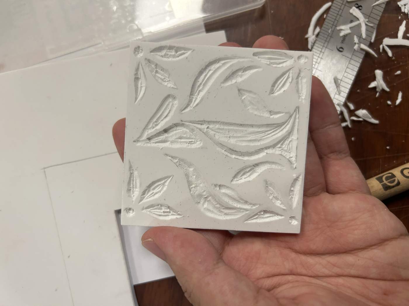
My English name begins with Y, while the Chinese character in my name is 一, meaning “one” and also the first number in 一、二、三、四、五. I developed these two ideas into a floral emblem, surrounding the central form with leaves so that my name appears to grow like a plant.
A SPELL
BUILT IN
LINES.
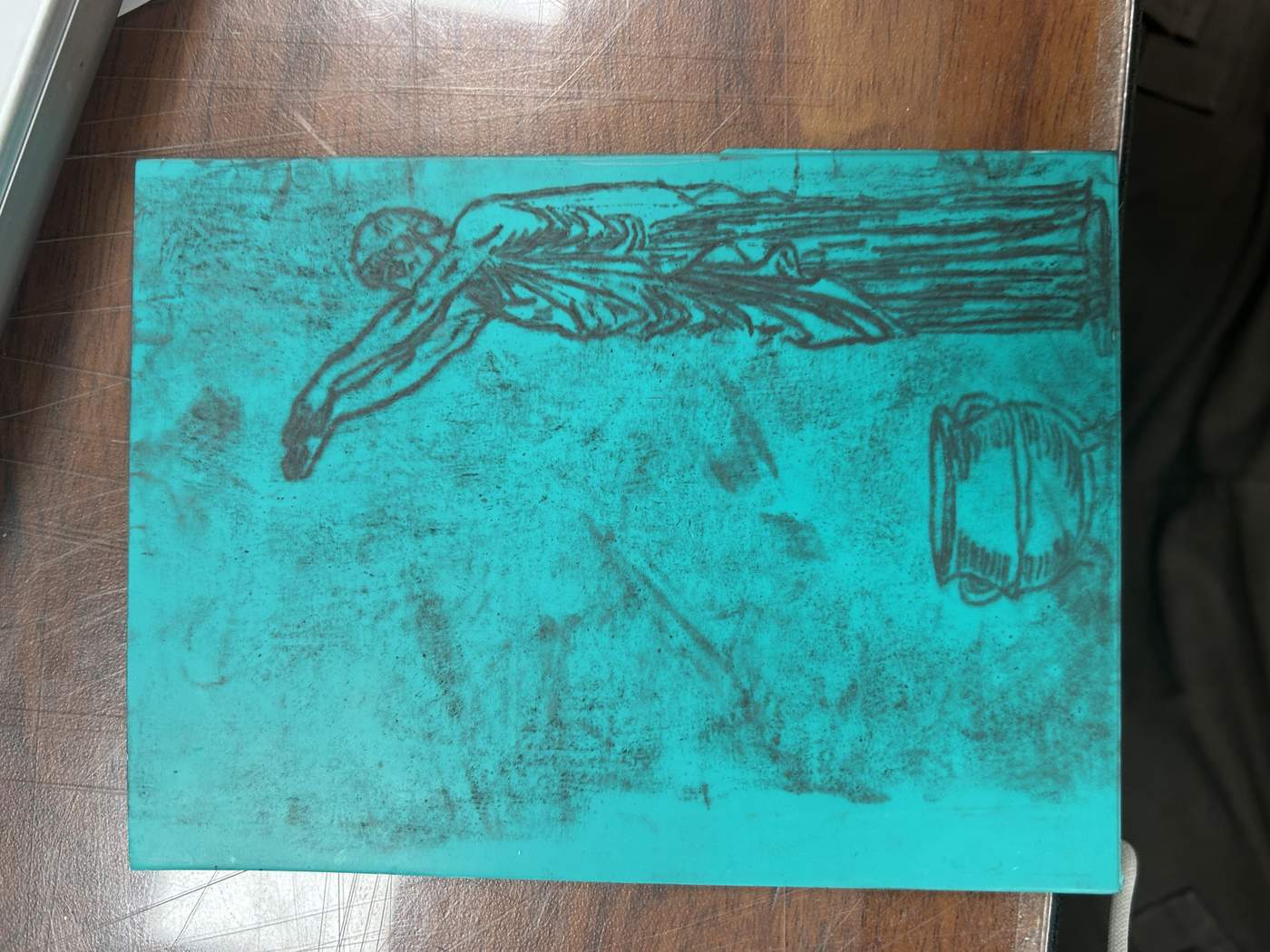
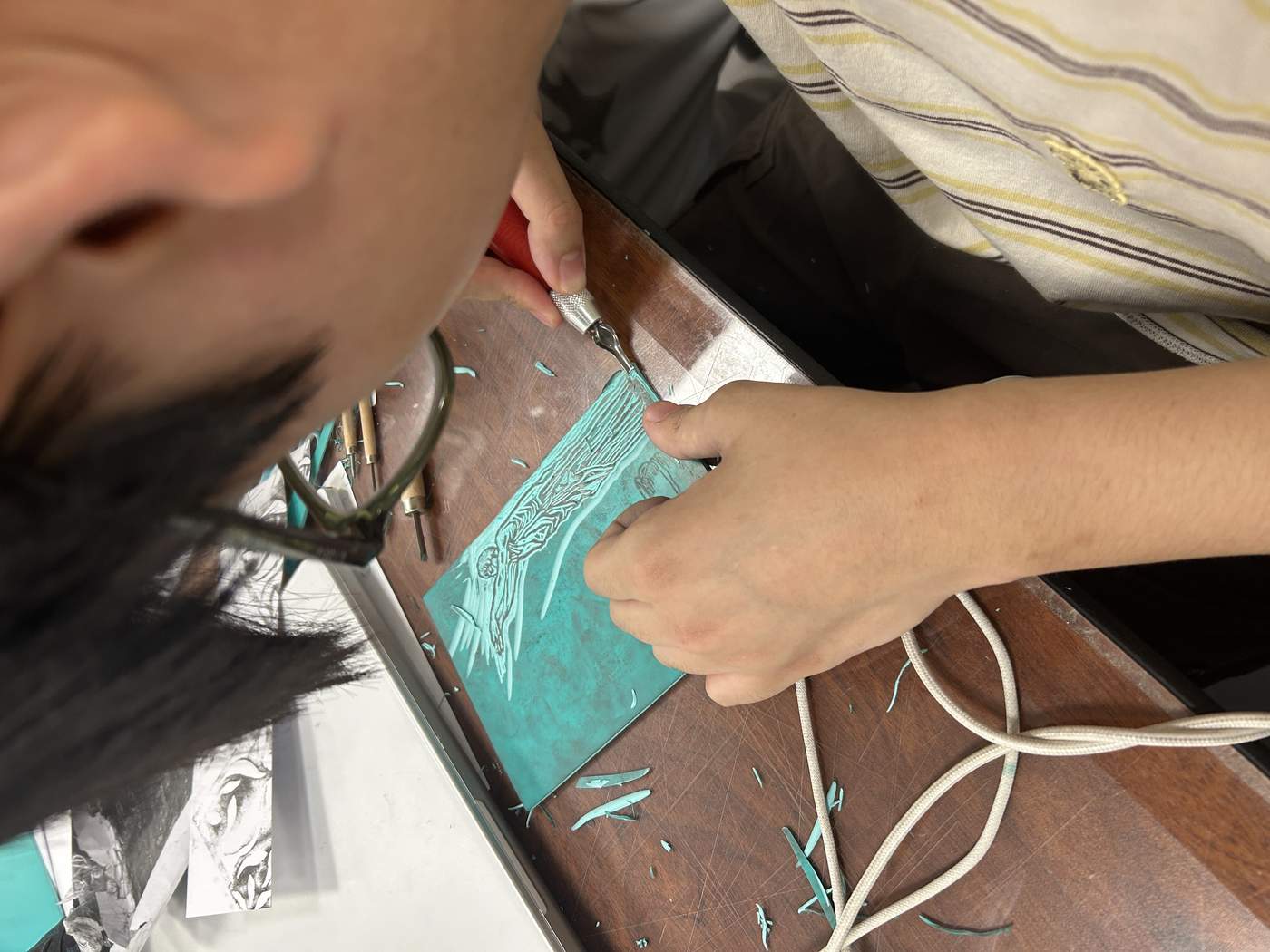
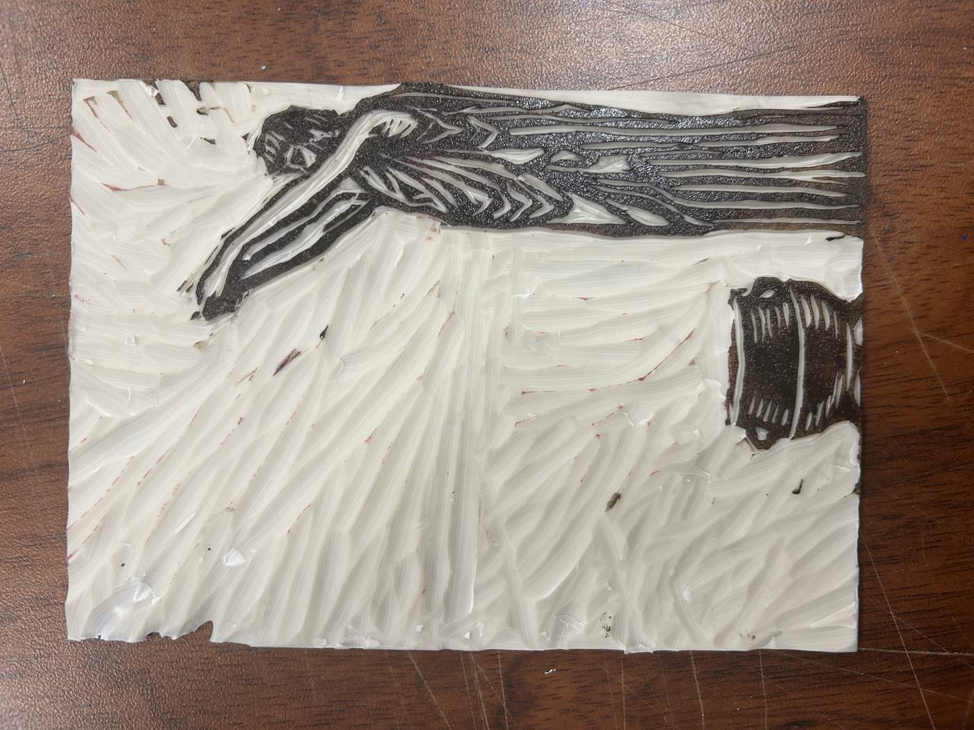
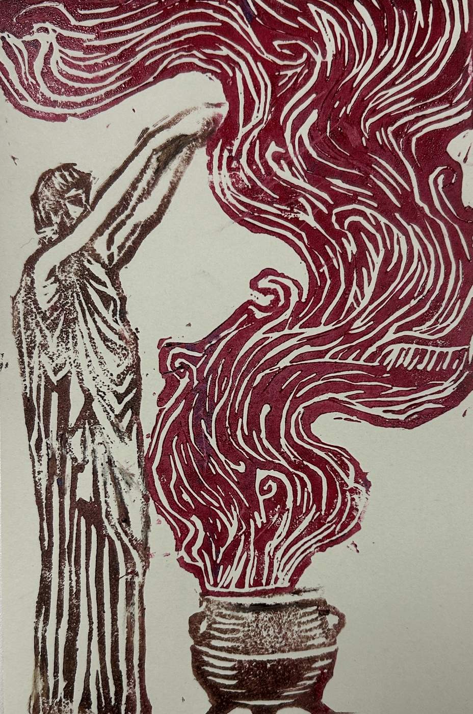
For the second design, I drew a male wizard performing a spell above a vessel. I simplified the body, robe and magical movement into strong linear shapes that could survive the carving process and remain readable when printed.
REMOVE.
COLOUR.
PRESS.
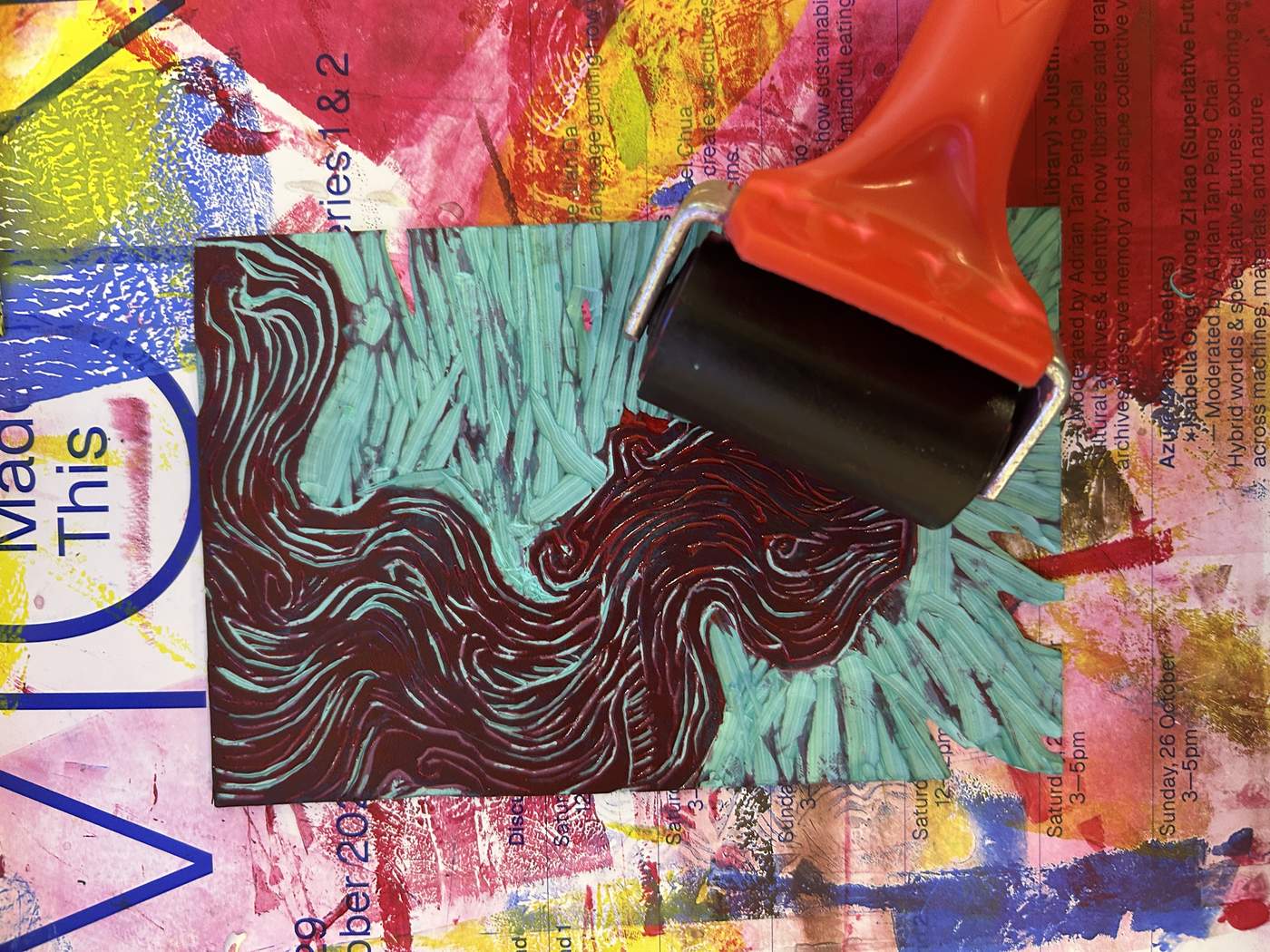
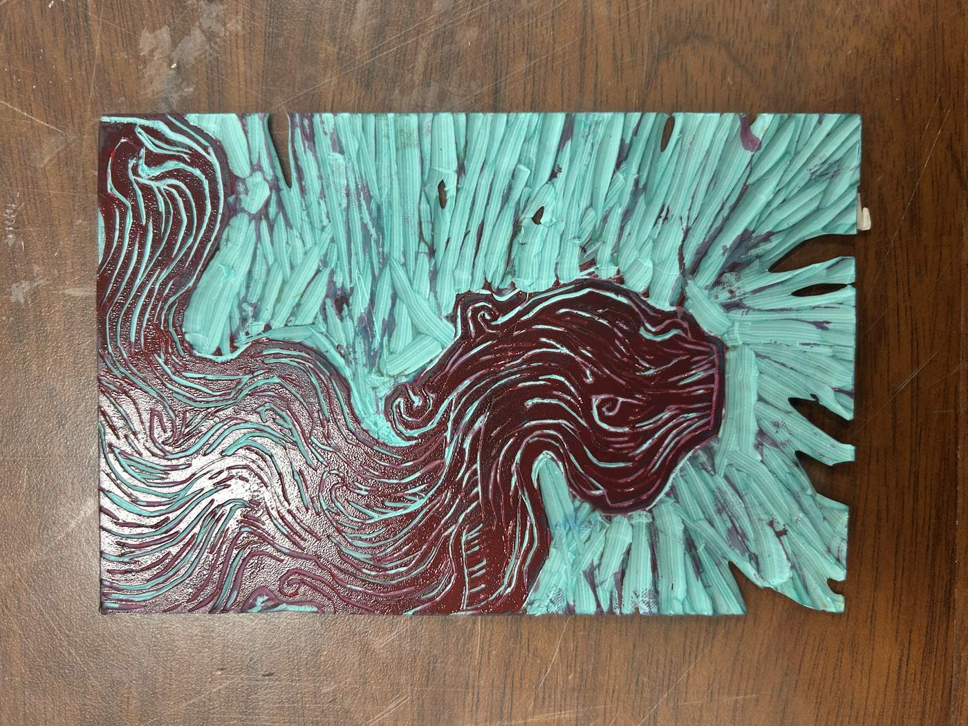
I carved the drawing step by step, clearing the areas that should remain unprinted while protecting the wizard’s outlines. After testing the relief surface, I applied colour with a roller. The roller spread the ink evenly across the raised areas and prepared the block for printing.
THE CUT LINE
BECAME THE
PRINTED LINE.
Relief printing taught me to plan positive and negative space before carving. I learned that every removed area changes the final image, and that clean carving, controlled rolling and consistent pressure are equally important. Moving from a personal name symbol to a figurative wizard design helped me become more confident with both simple and detailed compositions.
VECTOR · EFFECT · APPLICATION
POINTS
TO FORM
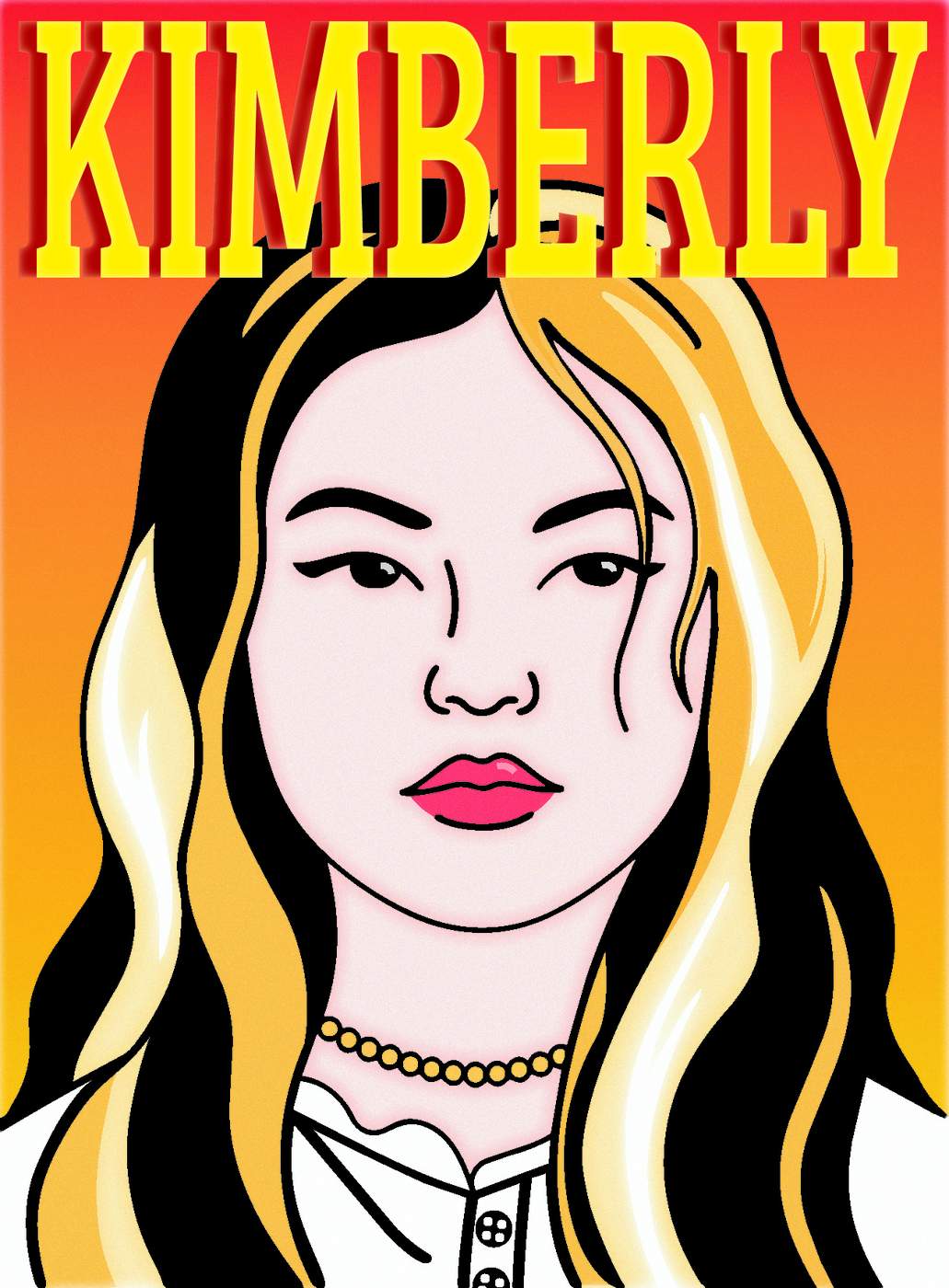
This week I moved from basic vector tools to a finished visual application. Icons introduced shape construction, the portrait developed my control of anchor points and effects, and the fruit illustration became a complete menu design.
SHAPE.
PATH.
TOOL.
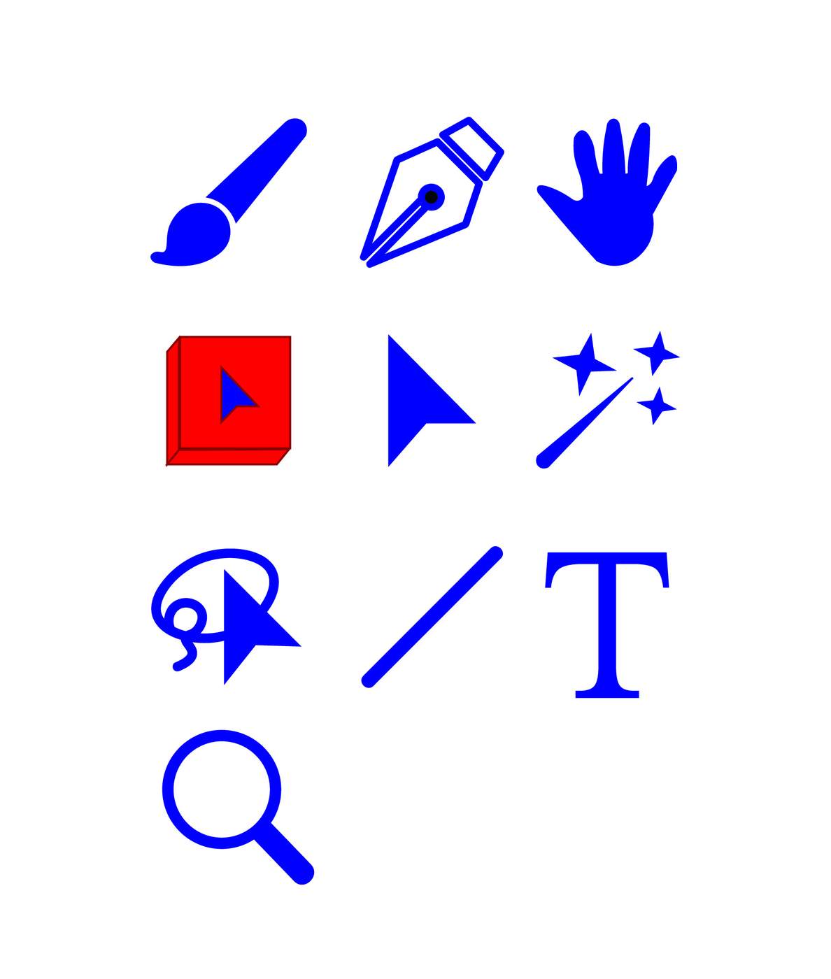
In the first class, I drew a set of simple interface and design icons. Reconstructing brushes, pen nibs, cursors, selection tools and type symbols helped me practise Illustrator’s most basic skills: combining geometric shapes, controlling paths, adjusting strokes and organising clean vector forms.
ANCHOR
EVERY
CURVE.
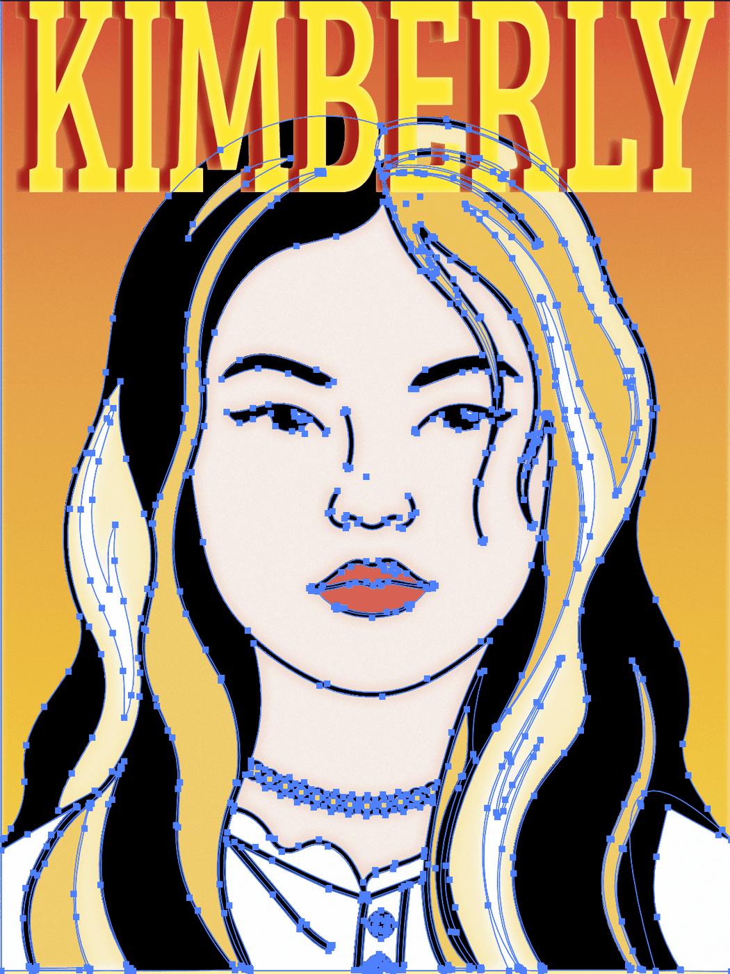
I developed the portrait from an earlier pencil drawing. First, I placed anchor points around the face, hair, clothing and smaller details. After closing and refining each path, I filled the shapes with colour and adjusted the curves until the features felt natural.
FLAT
SHAPES,
SOFT LIGHT.
To move beyond flat colour, I used Inner Glow, grain and related effects to build translucent highlights and natural shadows. These effects softened the vector edges, added depth to the skin and hair, and made the portrait feel more luminous.
COLOUR.
SHADOW.
VOLUME.
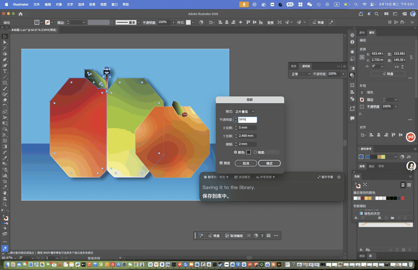
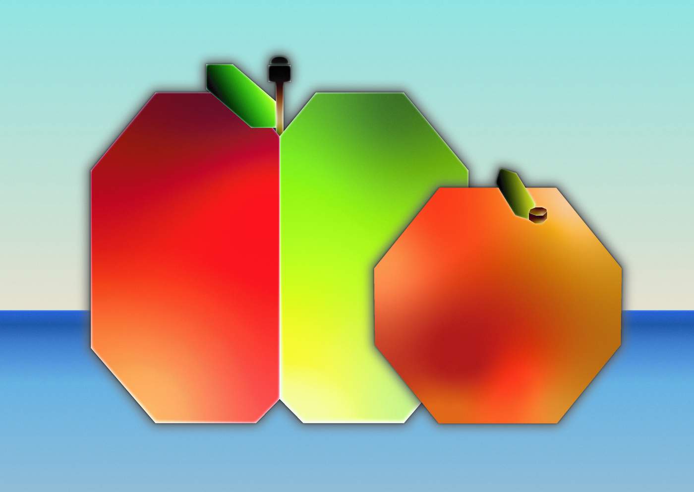
For the fruit exercise, I constructed simplified apple, pear and orange forms, then used gradients, drop shadows and grain to create volume. Testing the shadow settings helped the fruit sit more convincingly within the blue environment.
IMAGE
BECOMES
LAYOUT.
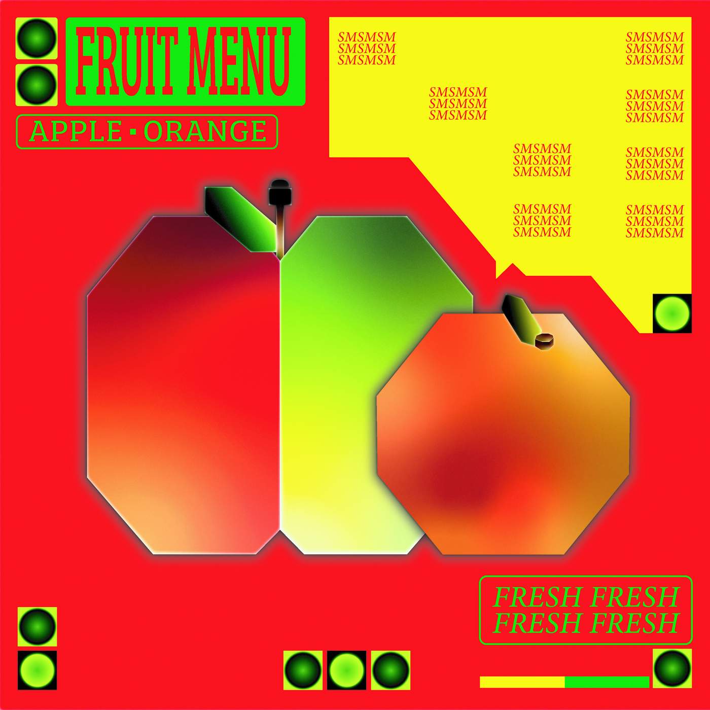
I transformed the fruit illustration into a menu by combining the artwork with a strong title, price areas, speech-bubble shapes and repeated decorative elements. This final step taught me how an illustration can become part of a wider communication design rather than remain a single image.
TOOLS BECAME
A VISUAL
SYSTEM.
Week 5 developed my confidence with Illustrator from basic tool control to complex image construction. I learned to manage anchor points carefully, use effects with restraint and carry one visual idea into a complete layout.
PHOTOSHOP · COMPOSITE · CONCEPT
WORLDS
IN TENSION
This week I used image selection, masking, compositing, colour adjustment and spatial distortion to build two surreal visual narratives. Each work turns familiar objects into a symbolic world shaped by psychological tension.
FREEDOM
OR CONTROL?
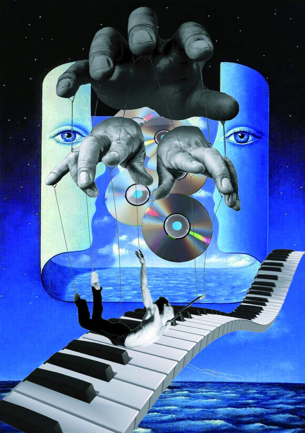
Acrophobia explores the tension between freedom and dependence. Controlling hands are themselves controlled, while the twisting keyboard destabilizes familiar order. Above an endless ocean, the suspended figure questions whether the strings offer protection or prevent escape.
BEFORE
THE UNKNOWN.
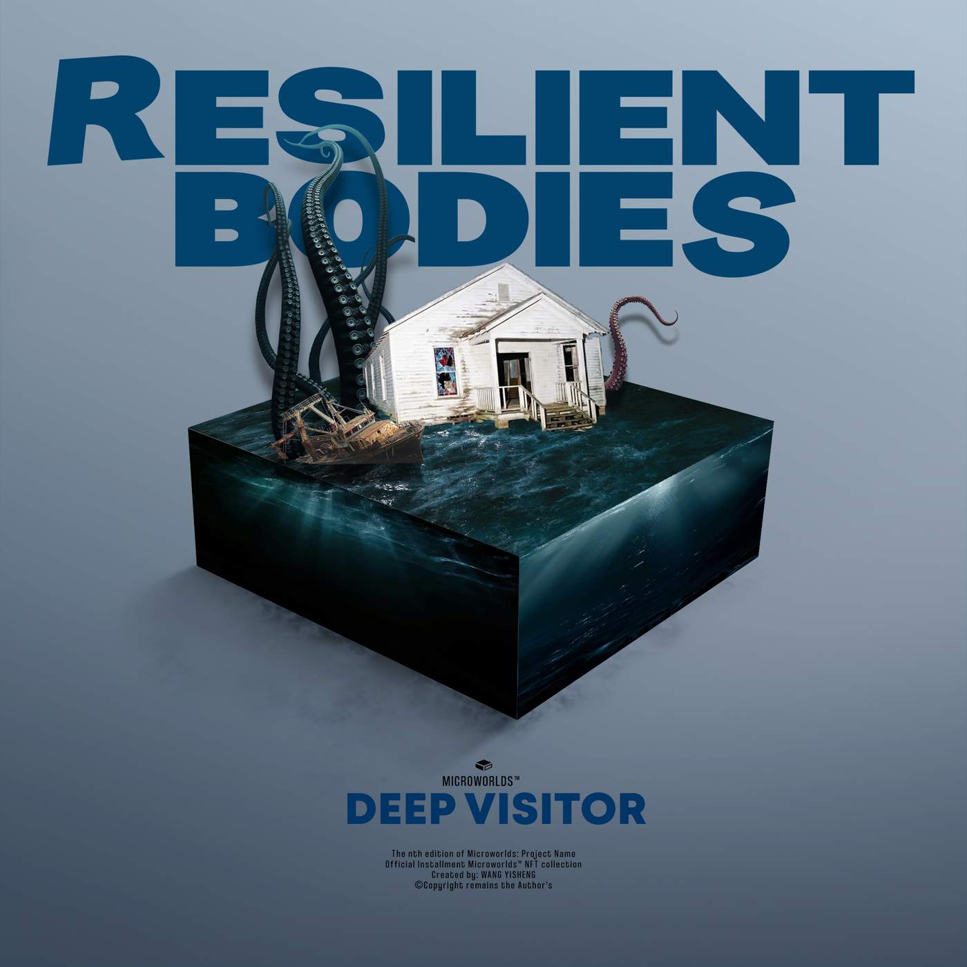
Deep Visitor examines human vulnerability before the unknown. The church offers refuge, while the shipwreck reveals failed ambition. Tentacles break the miniature world's boundaries, suggesting that resilience means confronting uncertainty rather than maintaining control.
COMPOSITE
IMAGES BECAME
VISUAL METAPHORS.
Through these two Photoshop exercises, I learned that technical control supports conceptual clarity. Scale, depth, colour and unexpected combinations can transform separate photographs into a coherent world with emotional meaning.